
Savvy
Enhancing financial awareness, budgeting behavior, and decision-making through a simplified, user-friendly expense management experience
My Role: UI Designer/ Design System
Duration: 4–5 Months
Project Type: NYIT_UXUI_Design_Club x Student welfare SGA
Tools & Process: Figma, Miro, User Interviews, Surveys, UX/UI Design, Advance Research / Navigation / Unity for AR / End-to-end research / LO-FI, HI-FI Wireframing/ Prototyping / User Testing / Competitive Analysis / Data Analysis / Performance Evaluation / Project Management
Overview: College life can be overwhelming – juggling academics, social life, and limited finances. Students often miss out on deals and benefits due to a fragmented system of coupons, ID-based verifications, and scattered offers.
I observed this problem firsthand during user research and realized that students were spending more time managing budgets than experiencing campus life. This insight sparked the Savvy initiative.
The Objective was to improve:
Help users track and understand spending behavior clearly
Reduce financial anxiety caused by poor visibility of expenses
Improve budget planning and decision-making
Create a simple, intuitive financial management experience
Increase user engagement with daily expense tracking

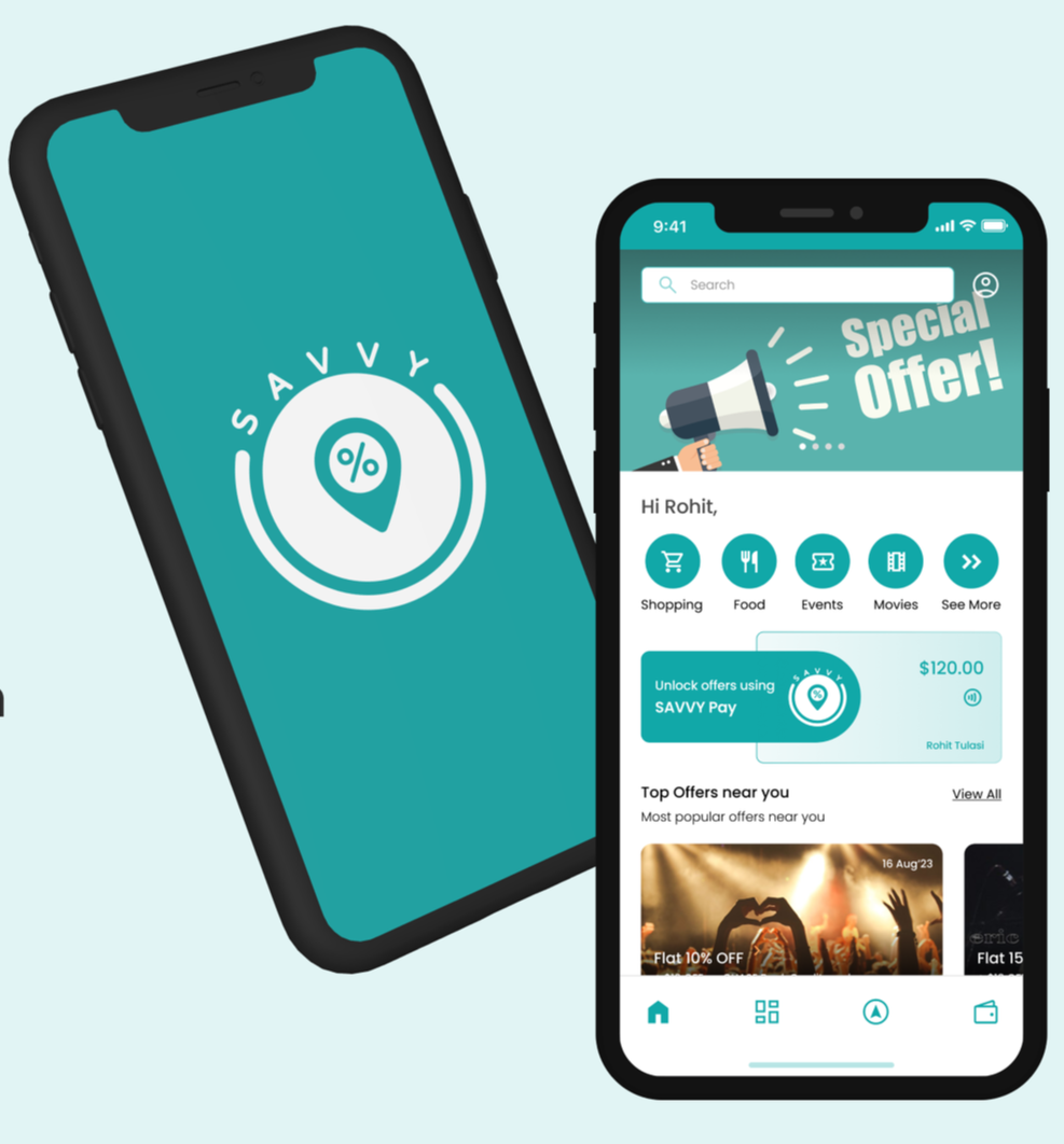
A Quick Peek Into the Solution
We designed a mobile-first expense management platform (Savvy) that:
Simplifies expense tracking through intuitive UI and quick entry flows
Provides visual insights (graphs, breakdowns) for better understanding
Helps users set budgets and track progress in real-time
Uses smart categorization and reminders
Creates a low-effort, habit-forming financial experience

Objective

Action
🔹 User Research & Empathy Mapping
Conducted surveys and interviews with 300+ students.
Identified pain points around discount discovery, ID verification, and tracking spend.
🔹 Wireframing & UI Grid
Created low-fidelity wireframes to map primary journeys
(discount discovery, ID scan, spending insights).Applied an 8pt grid system for visual consistency.
Developed component-based layouts using Figma.
🔹 Accessibility
Designed with WCAG 2.1 in mind – color contrast, focus states, large tap targets
SWOT
MOSCOW
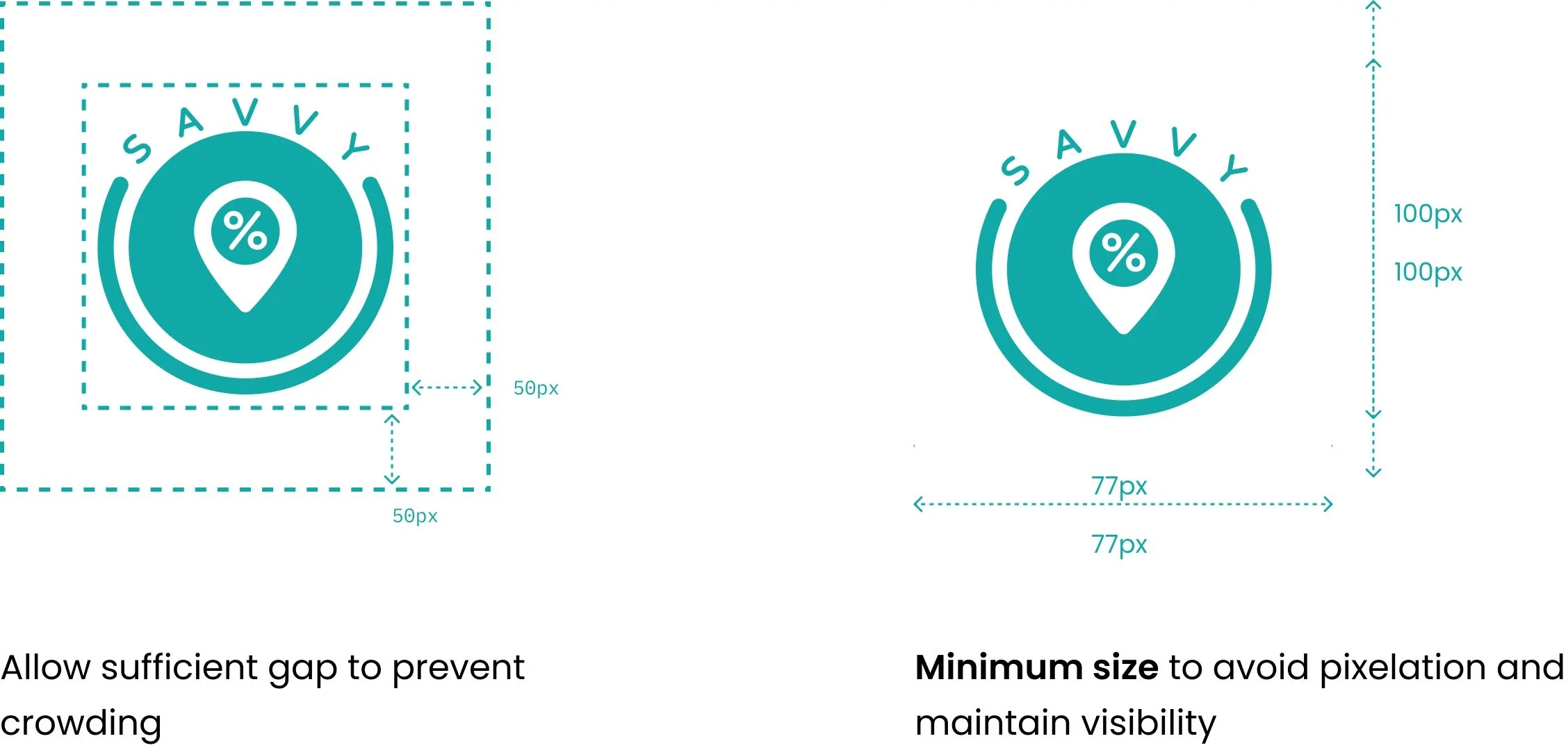
LOGO
what this logo means ?


MoodBoard

Empathy Mapping

User Mapping

Task
To design and prototype a student-first mobile experience that:
Integrates with school ID cards.
Provides real-time access to student discounts.
Encourages financial awareness.
Offers a smooth, modern UI.
Ensures accessibility and usability.
🔹 Design Tokens & Component Library
Developed a token system for:
Spacing (4px base)
Typography hierarchy (H1, H2, Body, Caption)
Color tokens (Primary Blue, Success Green, Alert Red)
Reusable components: Card views, bottom nav bar, CTA buttons, school ID card widget.
🔹 Prototyping in Figma
Designed interactive flows:
Sign up with School ID.
Explore & apply discounts by category, Wallet integration to track spending.
Created high-fidelity UI with emphasis on youthful color palette, intuitive icons, and microinteractions.
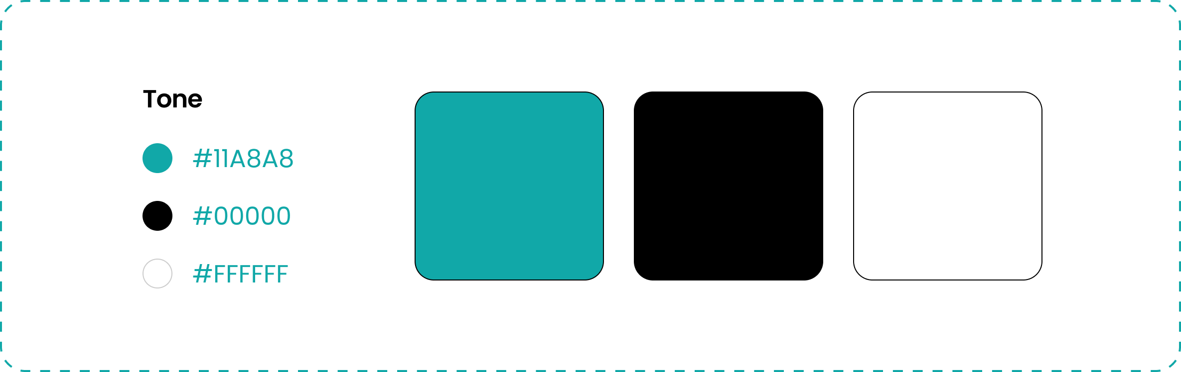
Brand Guidelines & Style Guide :
Icon Component
Button Component
Colors
Clear Space
Grid

Typography


Thumbnail

UI Library
Icon Library


Figma File Screenshots
Applied an 8px grid and 10 Count Column with Gutter 20 for visual consistency.

Flow Of screens


Splash Screen/ Micro Animation
Prototyping screen

Product Concept
Designed for students, our app transforms savings with location-based discounts and an exclusive in-app wallet. Discover nearby deals on food, shopping, and entertainment effortlessly. Streamlining student life, we aim to enhance the college journey and promote in-app wallet usage, providing a comprehensive solution for student savings.

Result
The final prototype enabled:
30% faster access to discounts via smart suggestions.
Unified interface for school ID + discounts + budgeting.
Increased student satisfaction (based on usability test feedback).
Shared with peers and advisors for feedback; received praise for clarity, design consistency, and problem-solution mapping.