
Redesigning Udemy: Increasing Course Completion Through a Quiz Rewards System
A UX case study for Udemy that turns passive course progress into a more engaging and rewarding learning experience
My Role : Lead WEB & Mobile UI/UX Design, Information Architect
Team : 3 Member
Duration: 1.3 Month
Volunteer : Udemy CO- Design Event
Tools & Responsibilities: UX Research, Information Architecture, User Flows, Wireframing, Prototyping, Usability Testing UI/UX Design / Information Architecture & Content Strategy Dev offs/ Navigation bar Layouts / Labeling/ LO-FI, HI-FI Wireframing/ Prototyping/ UX Research / User Testing
The objective was to improve:
Help learners stay motivated after enrolling in a course by making progress more interactive, rewarding, and easier to sustain.
The goal was to encourage active learning through short quizzes, instant feedback, and a points-based reward system that supports course completion.
A Quick Peek Into the Solution
Added short quiz checkpoints after course modules
Introduced points for quiz completion and correct answers
Created clear reward-progress visibility
Delivered instant feedback to reinforce learning
Connected earned points with discounts and future course incentives
Current State

Desired/Preferred State
GAP
Proposed Feature: Quiz with Rewards.
What Was the Gap?
Notes , Q&A, Downloads, Revies, Announcements
The existing learning journey focused mainly on watching videos and tracking completion. Learners had limited motivation to pause, test their understanding, or continue after losing momentum.
Tracking Users Growth
Findings

User’s Success Track , User Engagement
Key gaps included:
Passive learning experience
Low motivation after course enrollment
Limited feedback during lessons
No meaningful reward for progress
Course completion did not feel engaging or achievable
{
User Engagement

The quiz reward system creates value for both learners and the platform.
Encourages active participation instead of passive video watching
Helps learners remember and apply key concepts
Makes course progress feel more rewarding
Increases motivation to return and continue learning
Supports higher course completion and engagement
Creates opportunities for repeat course discovery and purchases
How Will the Solution Benefit Udemy?
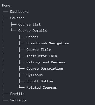
Understanding Information Architecture in
2 Aspects :
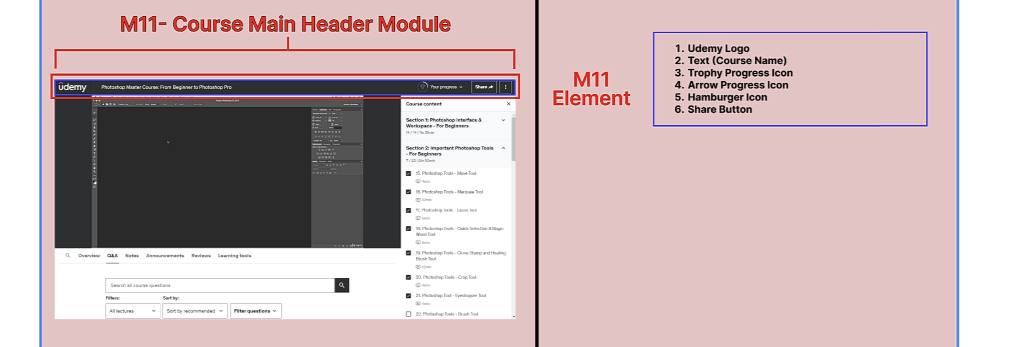
Pictorial representation of relationship btw Modules and Elements in IA:
Modules
The main building blocks of the learning experience.
Name
Purpose
Type: Navigation, Content, Feature, Utility, Footer
Elements
The individual components placed inside each module.
Content: Text, images, videos
Interactions: Buttons, forms, inputs
Navigation: Links and menus
Metadata: Labels and tags
-
1. Hierarchical relationships:
How modules contain elements or other modules.
”Sitemap Hierarchy” -
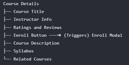
2. Associative relationships:
Illustrate how elements or modules are related to each other (e.g., a button triggers a modal window).
”Flow Diagram ” -
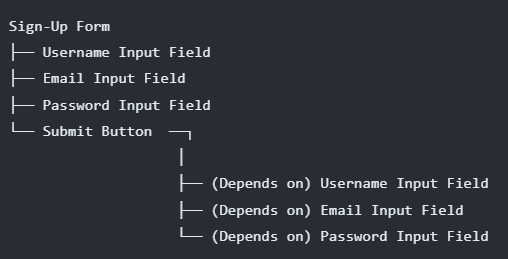
3. Dependency relationships:
Highlight how elements or modules rely on each other (e.g., a form relies on a specific input field).
”Component Diagram”
Visual Findings:
Modules and Elements
Module
Represented Each module as a rectangular block or a container with a clear label.
Used Red color to represent Module modules.
Representation of module By Capital “M”
Module
Element

Element
Represented Each Element as a rectangular block or a container with a clear label.
Used Blue color to represent Element modules.
A brief, descriptive label for the element
Element Type: Categorize elements by type, such as: Text, Image, Button, Form, Link


Visualizing IA in 2 Aspects :
Visualize IA in two aspects: Modules and Elements present in a Module.
Aspect 1: Modules
Module Attributes:
Module Name
Module Description
Module Type: Categorizing modules by type, such as:
Navigation
Content
Feature
Utility
Footer
Aspect 2: Elements Present in a Module
Content Elements: Text, images, videos, or other media.
Interactive Elements: Buttons, forms, inputs, or other interactive components.
Navigation Elements: Links, menus, or other navigation aids.
Metadata Elements: Labels, tags, or other metadata associated with content.
Element Attributes:
Element Name
Element Type: Categorize elements by type, such as:
Text
Image
Button
Form
Link
Visual Findings:
Modules and Elements
Module
Represented Each module as a rectangular block or a container with a clear label.
Used Red color to represent Module modules.
Representation of module By Capital “M”
Module
Element
Element
Represented Each Element as a rectangular block or a container with a clear label.
Used Blue color to represent Element modules.
A brief, descriptive label for the element
Element Type: Categorize elements by type, such as: Text, Image, Button, Form, Link
-

01
Together, we outline a path forward that’s realistic, strategic, and tailored to your specific needs.
-

02
You’re part of the process. We keep communication open and decisions shared—no black boxes or surprises.
-

03
When we deliver, it’s not just a finished product—it’s a solution you can trust, backed by real care and effort.
Briefly Describe Current and Proposed Feature
1. Current Course Features
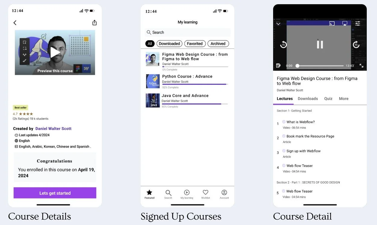
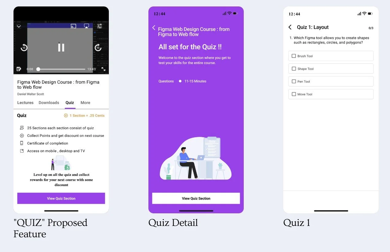
2. Proposed Course Feature“ QUIZ”
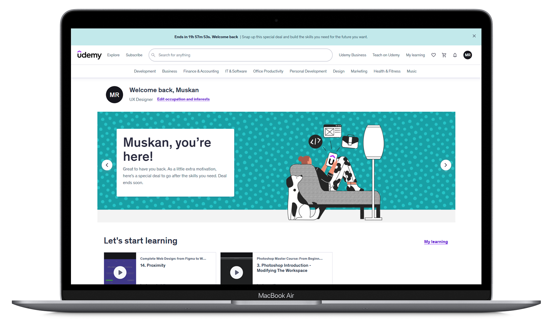
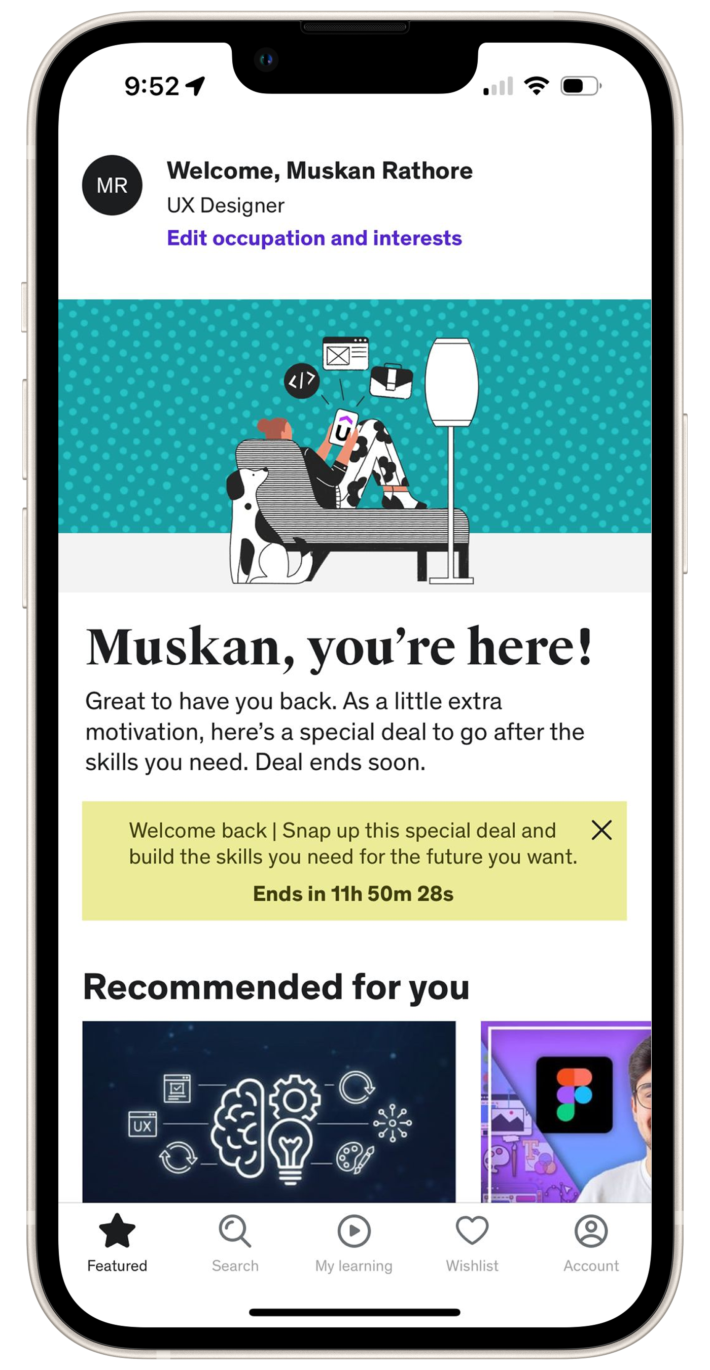
On Udemy, courses come with various features like Q&A, announcements, reviews, notes, overviews, and learning tools. Each section of the course content is briefly described,
On the right side of the interface, giving learners an idea of what they'll learn.
About Feature :
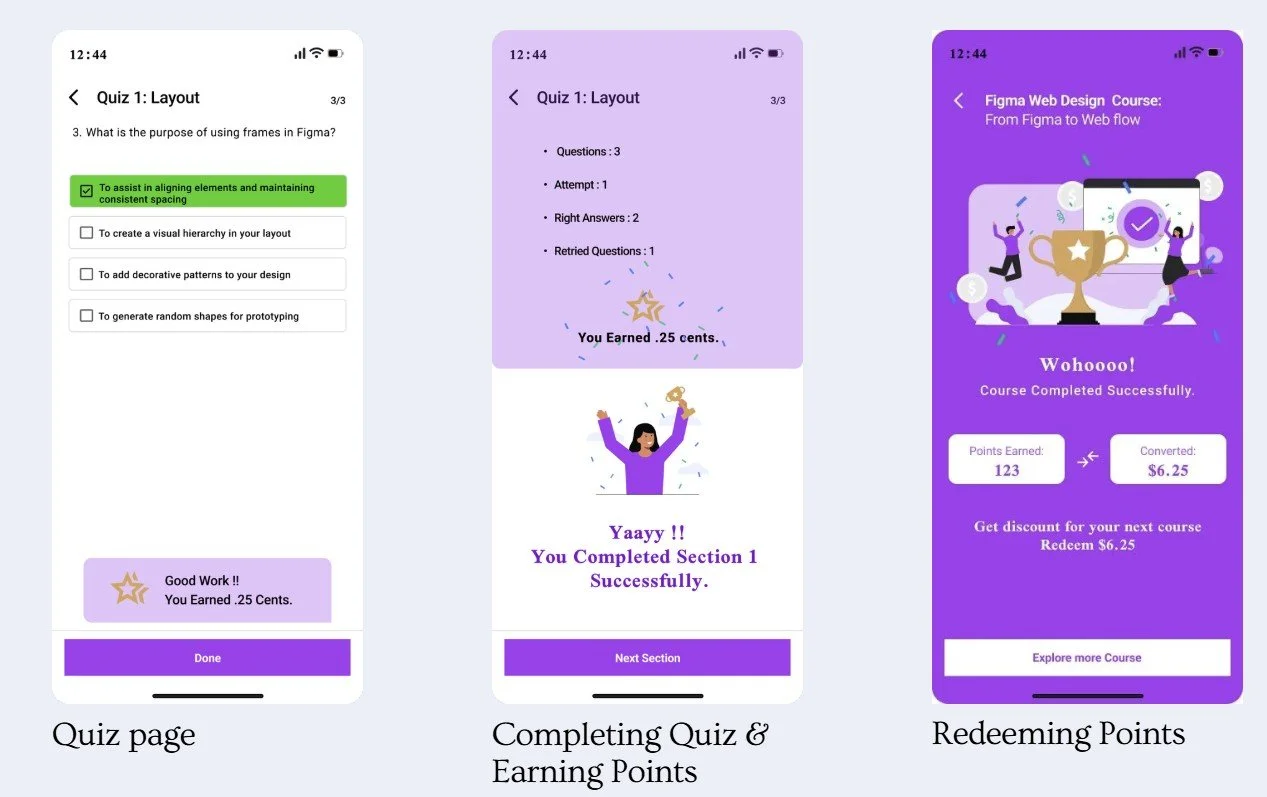
Each course section has a quiz.
Completing a quiz earns you 5 points.
Points convert into discounts for future courses.
Example: Completing 25 sections earns 125 points.
125 points equals a $6.25 discount on your next course.
Discounts are automatically applied to the next course purchase.
Benefits :
Increased Engagement: Motivates students to complete quizzes and interact with the app.
More Purchases: Encourages buying more courses to use earned discounts.
Track Progress:
Points and quiz scores help students see their learning progress and success rates.
This system boosts user engagement and educational outcomes, making learning rewarding and effective.


Task 1 : Find recommendation/personalization /career goal on Home page
Task Performed
Task 2 : Can you search for “Figma Web Design course “ and get a overview and after that can you buy it ( un paid )
Task 1 : Find recommendation/personalization /career goal on Home page
Task 3: Can you go on the course that you just purchased ... click on that.
Task 2 : Can you search for “Figma Web Design course “ and get a overview and after that can you buy it ( un paid )
Task 3: Can you go on the course that you just purchased ... click on that.
Usability Finding /Analysis
Task
Can users easily find and complete quizzes, see their progress and points?
Are users satisfied and motivated with the points system, and what are their opinions on earning and using points for course discounts?
Your user think this will encourage course completion and increased course purchases for users?
Remote Testing Dynamics
Utilizes Zoom for virtual interaction, enabling participants to access the website in their familiar settings.
Mimics real-world usage, offering a realistic evaluation of the website's usability.
Participants &Testing Environment
How did we conduct our tests?
Technical Requirements
Specified necessary equipment like a stable internet connection, computer or mobile device, and Zoom access.
Ensures all participants can effectively engage in the test without technical hindrances.
Ensuring Comfort and Openness
Created a relaxed environment, encouraging honest feedback.
Aims for genuine interactions with the website, vital for authentic usability insights.
Success rate
Conclusion
The points and rewards system aligns with Udemy's mission to make education accessible and convenient.
It boosts user engagement by simplifying quiz completion, progress tracking, and redeeming discounts.
Users are satisfied, motivated to complete more sections and courses, and show increased quiz and course completion rates, enhancing overall learning outcomes.
This feature effectively supports user engagement and educational success on the platform.
Click on the button to View 1-page Brief of IA Udemy Redesign