
Hello,
I am Muskan Rathore

〰️
Frontend Engineer
〰️
UI/UX Designer
〰️
Interaction Designer
〰️
AR / VR
〰️ Frontend Engineer 〰️ UI/UX Designer 〰️ Interaction Designer 〰️ AR / VR


'why' behind the 'how.'
I bridge the gap between human psychology and digital design to create experiences that don't just work they feel right, intuitive, helpful, and most importantly human.
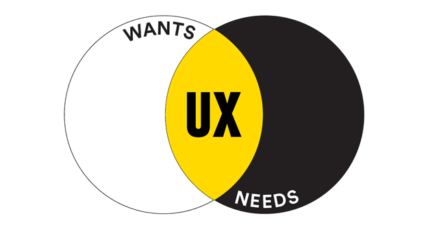
How my work stands out


Selected work
Here is a sample of my user center initiatives, I’ve worked on
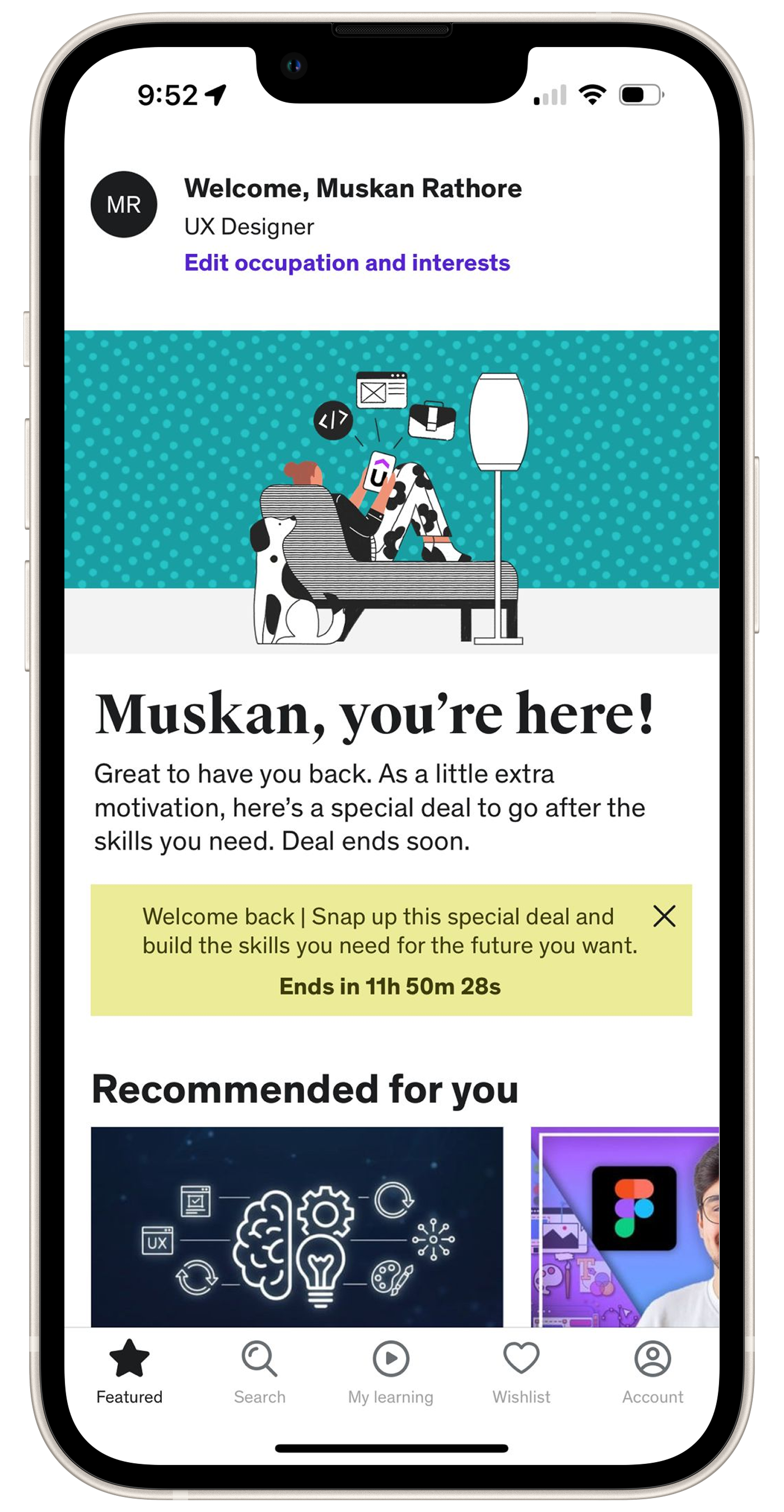
Udemy App Redesign / Proposed design
The purpose of Udemy is to make education accessible and convenient for everyone, regardless of where they are or their background. It's all about providing a platform for people to learn and enhance their skills through online courses.
Success Track | User Engagement
Case Study 01
Information Architecture, UX/UI Design
Case Study 02
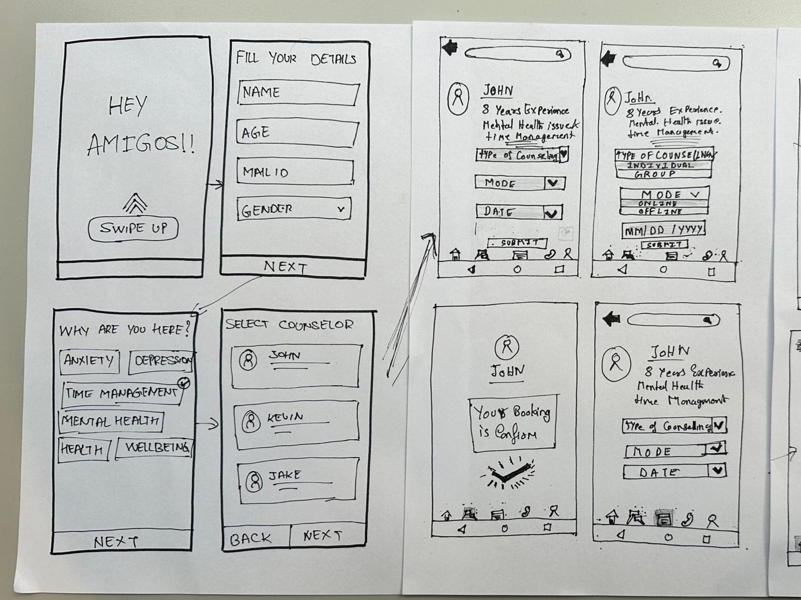
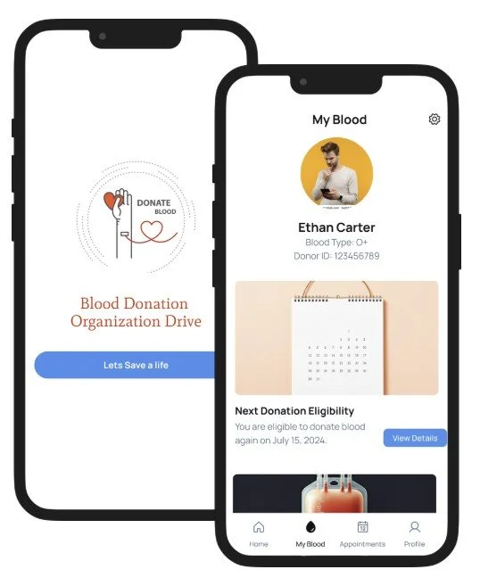
Blood Donation Tracker
Designed a user-centered digital healthcare platform connecting blood donors with hospitals, featuring gamified donor engagement, transparent donation tracking, and streamlined admin workflows.
Research-driven design (256+ user interviews, 15 platform comparisons) resulted in 84% transparency demand validation, 73% gamification acceptance, and 25% faster admin task completion
UX/UI Design, Navigation Prototyping
Case Study 03
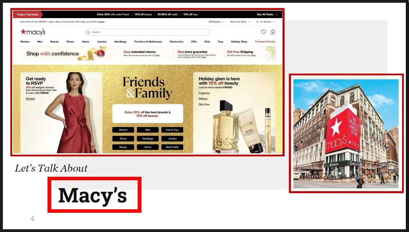
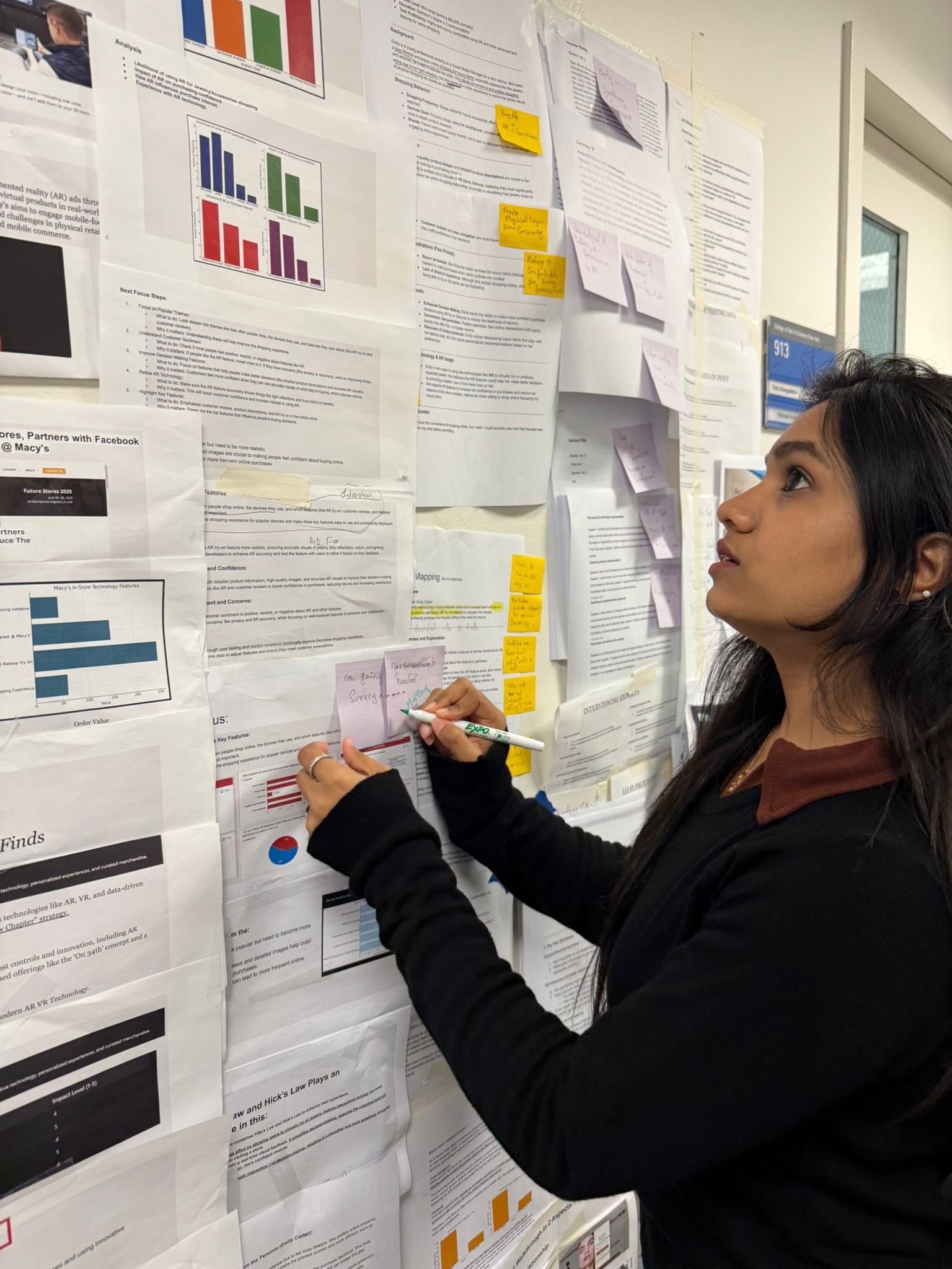
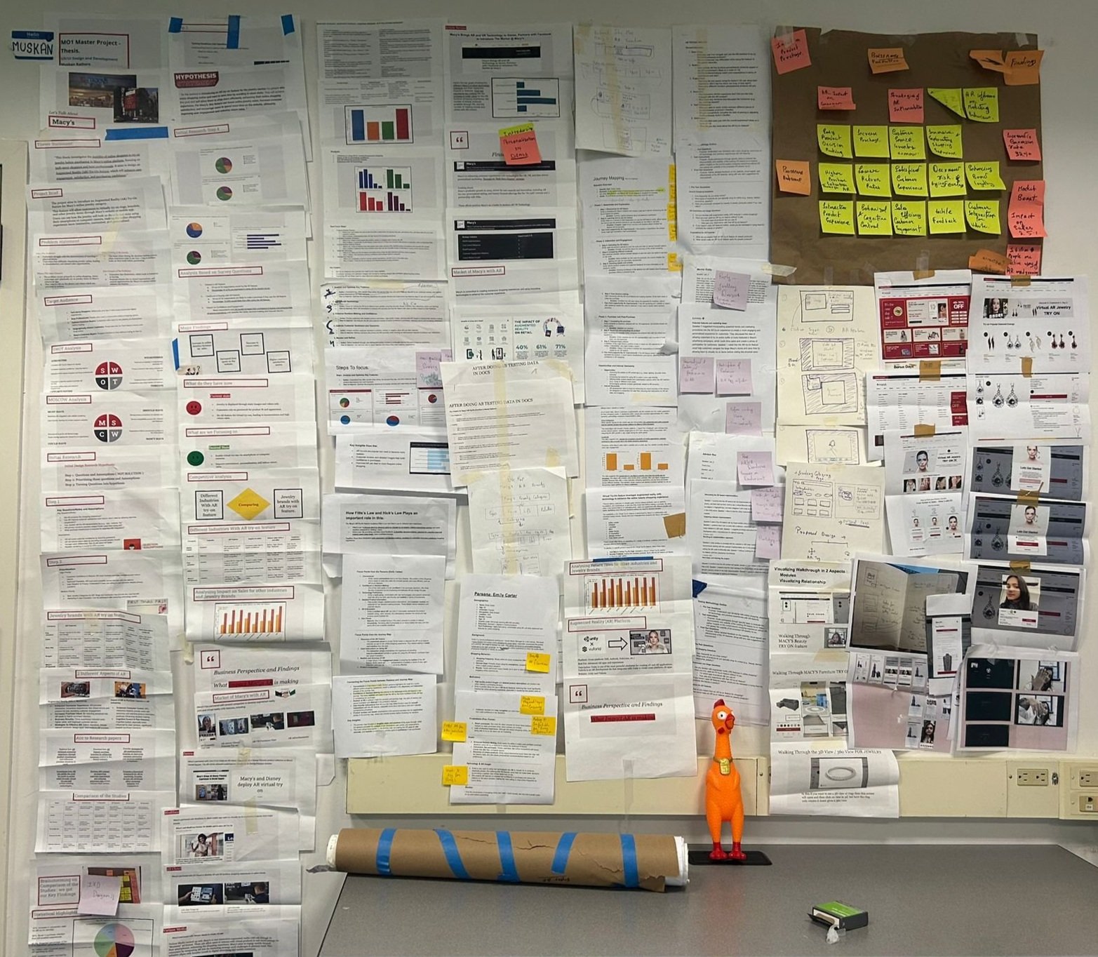
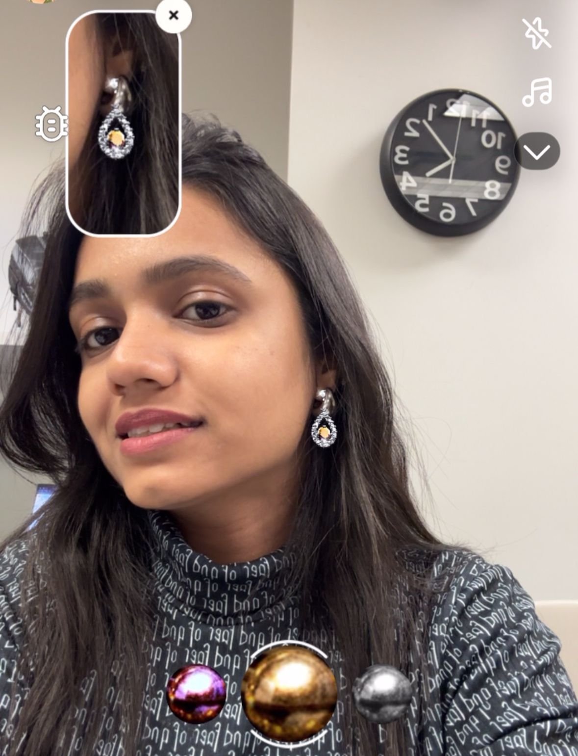
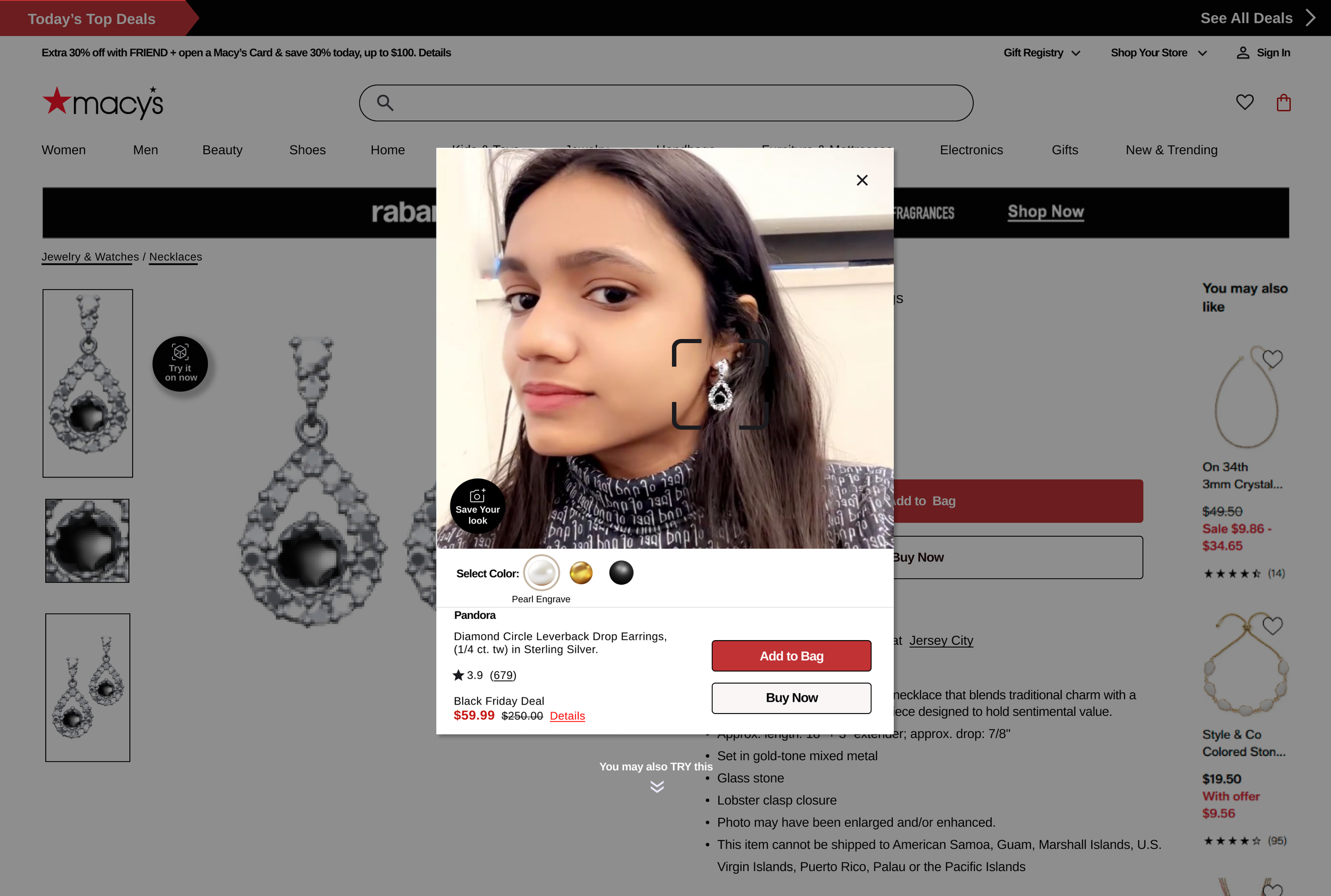
Macy’s E-Commerce
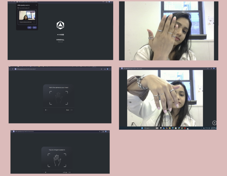
Virtual AR Try-On Optimization
Enhancing Awareness and Navigation in Macy’s Virtual AR Try-On to Improve Online Shopping Visibility and Engagement, High-Consideration Product Pages to Increase Purchase Confidence & Customer Conversion
From Visibility to Engagement
UX Design & Research with AR integration
Case Study 04
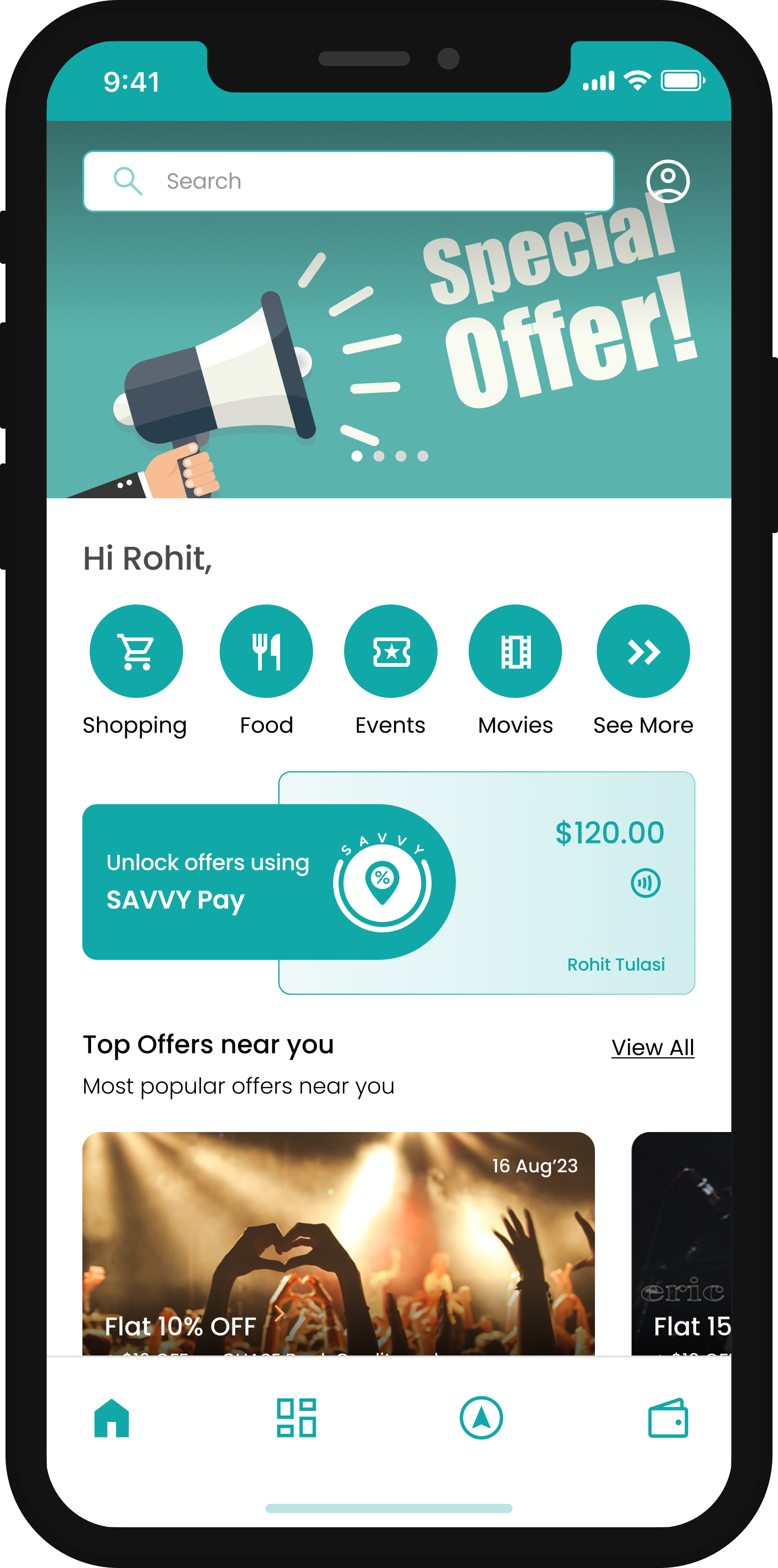
Savvy
An App were our core objective is to simplify students' lives, offering convenience, savings, and exploration with seamless integration of school ID cards.
"Empowering Students: Convenience, Savings, Exploration –One Card, Endless Possibilities”
UI & UX Design
Case Study 05
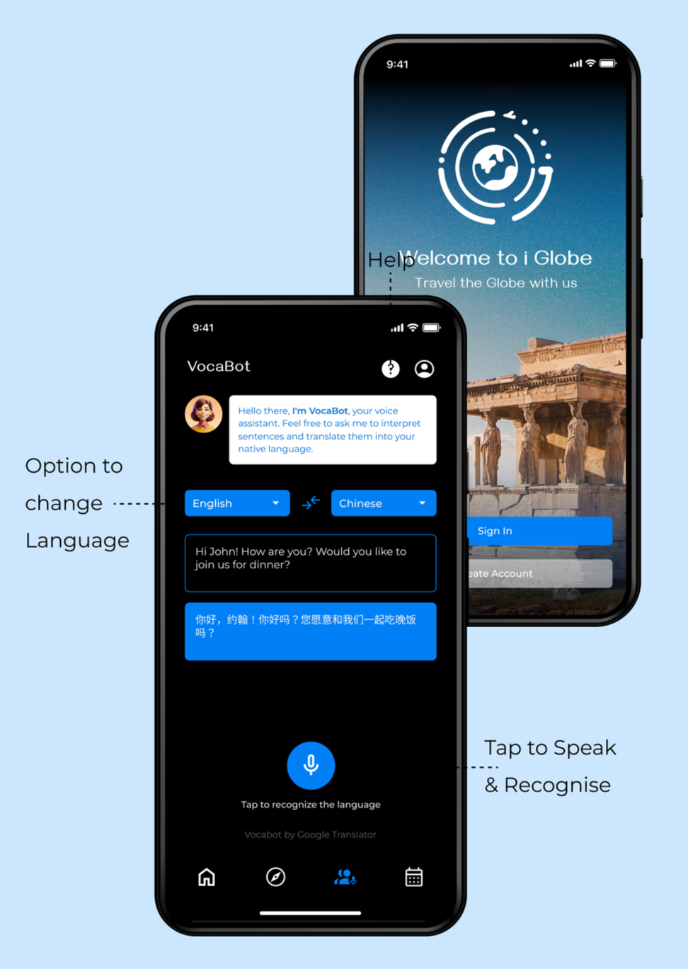
I-Globe
Travelers often struggle to engage with local communities due to language barriers, resulting in challenges when exploring popular destinations without proper guidance. The I Globe app aims to bridge this gap, facilitating communication between locals and travelers..
UI Design and Prototyping
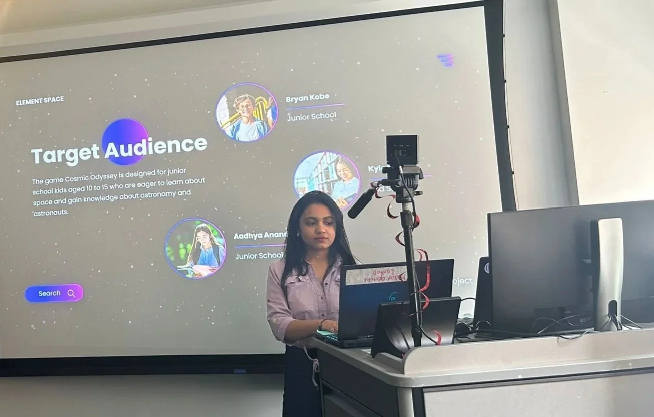
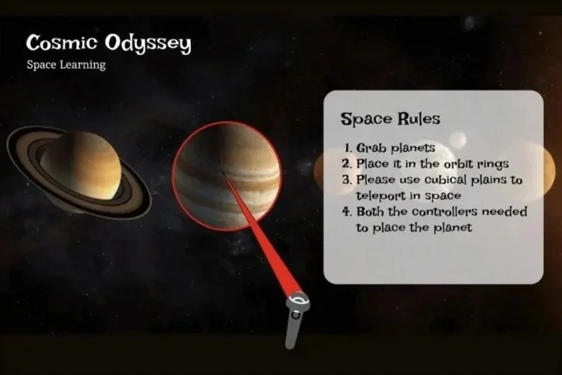
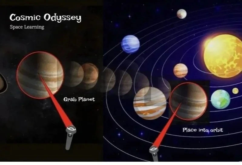
Cosmic Odyssey:Space learning game
Cosmic Odyssey is a VR space exploration game for kids aged 10 to 15, designed to educate and inspire. By using immersive VR technology and intuitive interactions, the game allows young learners to explore celestial objects and understand space concepts.
Cosmic Odyssey aims to ignite curiosity and foster a passion for astronomy and astronautics.
Case Study 06
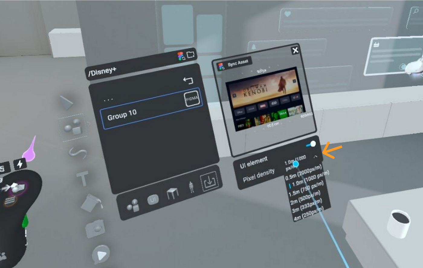
AR / VR / MR

AR Filter HCI
We created Snapchat and Meta Spark AR filters that utilize face recognition, motion tracking, and wink detection. These filters offer a wide range of interactive and dynamic effects, enhancing user engagement with diverse and creative elements.
Case Study 07
AR / VR / MR

Frisco, Texas Covid Website Research
Welcome to our comprehensive analysis of the Frisco, Texas COVID-19 website. Our focus today is to delve into the heuristic evaluation and usability testing of this crucial online resource. In the face of a global pandemic, accessible and user-friendly digital information is more important than ever. This presentation will uncover how effectively the Frisco COVID-19 website meets these needs.
Case Study 08
UX Research & Foundation

Quote
“We must design for the way people behave, not for how we would wish them to behave.”
– Donald A. Norman, Nielsen Norman Group