
Redesigning Udemy: Enhancing UX with a New Feature
“Empower Through Exploration, Teach with Passion, Lesson for a Lifetime”
My Role : Lead WEB & Mobile UI/UX Design, Information Architect
Team : 3 Member
Duration: 1.3 Month
Volunteer : Udemy CO- Design Event
Tools & Process: UI/ UX Design / Information Architecture & Content Strategy Dev offs/ Navigation bar Layouts / Labeling/ LO-FI, HI-FI Wireframing/ Prototyping/ UX Research / User Testing
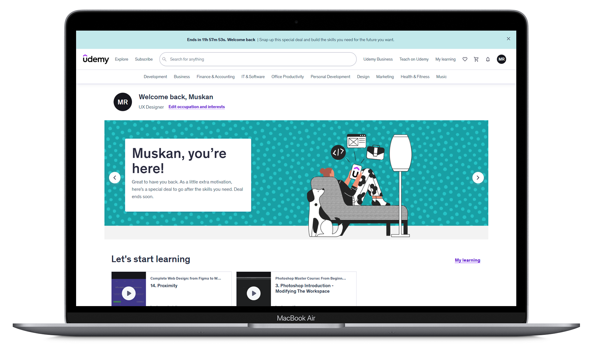
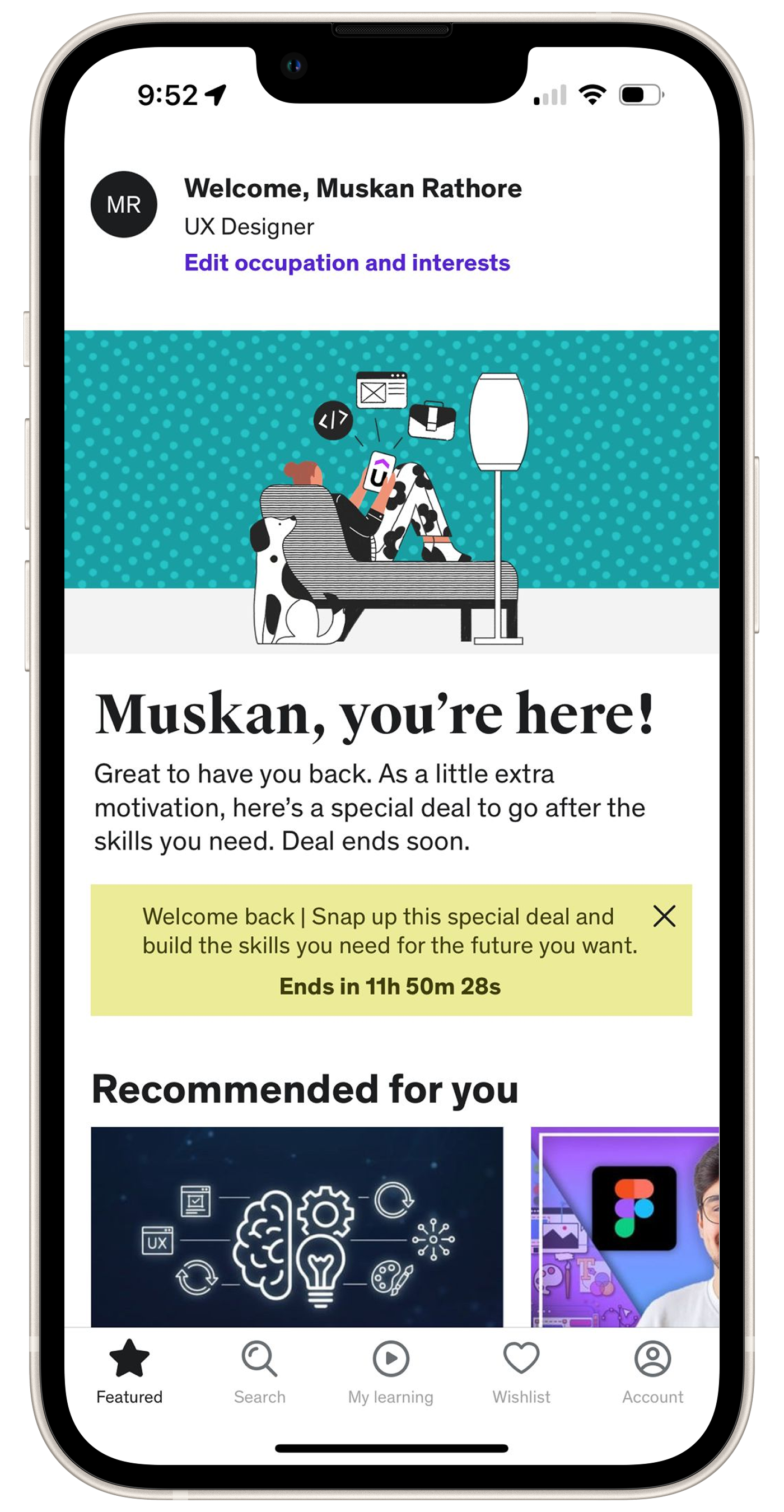
Project Overview: This project describes a redesign of Udemy’s learning experience by introducing a quiz-based rewards feature that motivates learners to complete course sections. The feature allows users to earn points through quizzes, which can be redeemed as discounts on future courses, helping increase engagement, course completion, and learning motivation.
What’s been
done:
Developed user personas based on qualitative insights and learner motivations
Designed information architecture and user flows to improve the course learning journey
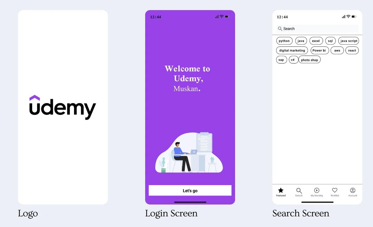
Created low-fidelity and high-fidelity wireframes for the redesigned platform experience
Designed a quiz-based reward system to motivate learners and increase course completion
Built interactive prototypes and validated concepts through usability testing
Defined UX strategy focused on improving engagement, retention, and learning outcomes
A Quick Peek Into the Solution
Designed a gamified learning experience for Udemy that motivates learners to complete courses through a quiz-based reward system.
Scope of Work
The solution focuses on improving course engagement, learning motivation, and completion rates while keeping the experience simple and intuitive.
• Researching learning behavior and engagement patterns
• Identifying why users drop courses before completion
• Designing an interactive quiz checkpoint system
• Creating a reward and points mechanism for motivation
• Designing responsive web and mobile learning flows
• Developing high-fidelity prototypes for usability testing

Online learning platforms provide access to thousands of courses, yet many learners struggle to stay engaged and complete them. Despite enrolling with strong intentions, users often lose motivation midway through courses.
Through research and observation, several key challenges emerged:
• Low course completion rates many learners start courses but drop out before finishing
• Lack of motivation and engagement during long learning sessions
• Passive learning experience with limited interaction or reinforcement
• No clear sense of progress or achievement while learning
These challenges indicated the need for a more engaging and motivating learning experience that encourages learners to stay consistent and complete their courses.
Understanding the problem
Target Audience:
Lifelong Learners: People eager to learn and grow continuously.
Professionals: Individuals aiming to boost their careers or gain new skills.
Students: Both traditional students and those seeking extra learning opportunities.
Entrepreneurs: Individuals looking to enhance their business knowledge and skills.
Success Metrics:
User Growth
Course Enrollment
Course Completion
User Satisfaction
Revenue

Current State

|
Desired/Preferred State
|
According to Bloom's Taxonomy
GAP
Proposed Feature: Quiz with Rewards.
GAP Analysis
|
Course with Feature :
Notes
Q&A
Downloads
Review
Announcements

User Engagement
Findings
|

User’s Success Track
User Engagement

Tracking Students Growth
Visualizing IA in 2 Aspects :
Modules and Elements for Effective Design
Visualize IA in two aspects: Modules and Elements present in a Module.
Aspect 1: Modules
Module Attributes:
Module Name
Module Description
Module Type: Categorizing modules by type, such as:
Navigation
Content
Feature
Utility
Footer

Hierarchical relationships: how modules contain elements or other modules.
”Sitemap Hierarchy”
Aspect 2: Elements Present in a Module
Content Elements: Text, images, videos, or other media.
Interactive Elements: Buttons, forms, inputs, or other interactive components.
Navigation Elements: Links, menus, or other navigation aids.
Metadata Elements: Labels, tags, or other metadata associated with content.
Element Attributes:
Element Name
Element Type: Categorize elements by type, such as:
Text
Image
Button
Form
Link
Visualizing Relationship

Associative relationships: Illustrate how elements or modules are related to each other (e.g., a button triggers a modal window).
”Flow Diagram ”
Dependency relationships: Highlight how elements or modules rely on each other (e.g., a form relies on a specific input field).
”Component Diagram”
Visual Findings:
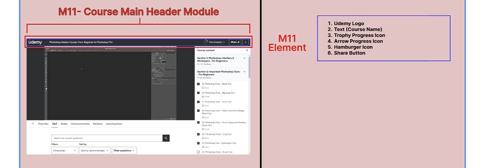
Modules and Elements
Module
Represented Each module as a rectangular block or a container with a clear label.
Used Red color to represent Module modules.
Representation of module By Capital “M”
Module
Element


Element
Represented Each Element as a rectangular block or a container with a clear label.
Used Blue color to represent Element modules.
A brief, descriptive label for the element
Element Type: Categorize elements by type, such as: Text, Image, Button, Form, Link


Briefly Describe Current and Proposed Feature
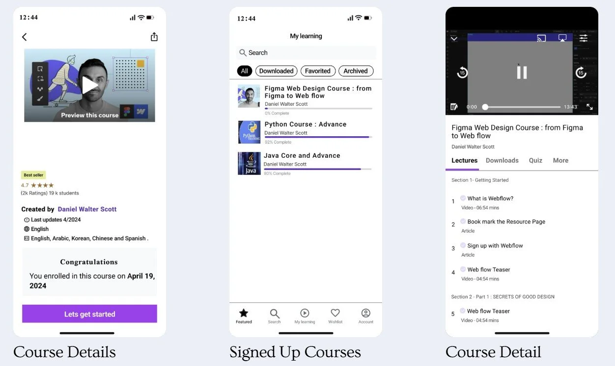
1. Current Course Features
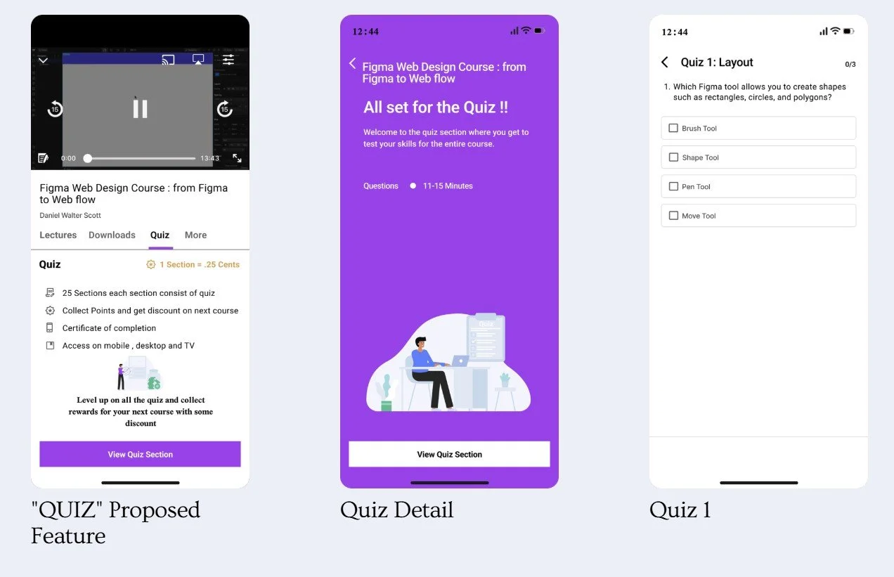
2. Proposed Course Feature“ QUIZ”
On Udemy, courses come with various features like Q&A, announcements, reviews, notes, overviews, and learning tools. Each section of the course content is briefly described,
On the right side of the interface, giving learners an idea of what they'll learn.
About Feature :
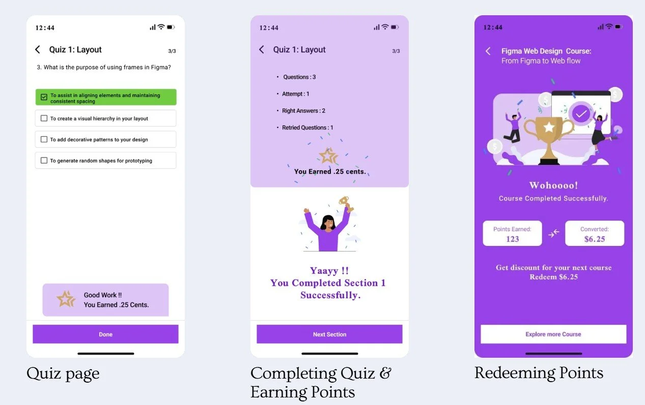
Each course section has a quiz.
Completing a quiz earns you 5 points.
Points convert into discounts for future courses.
Example: Completing 25 sections earns 125 points.
125 points equals a $6.25 discount on your next course.
Discounts are automatically applied to the next course purchase.
Benefits :
Increased Engagement: Motivates students to complete quizzes and interact with the app.
More Purchases: Encourages buying more courses to use earned discounts.
Track Progress:
Points and quiz scores help students see their learning progress and success rates.
This system boosts user engagement and educational outcomes, making learning rewarding and effective.


Task 1 : Find recommendation/personalization /career goal on Home page
Task Performed
Task 2 : Can you search for “Figma Web Design course “ and get a overview and after that can you buy it ( un paid )
Task 1 : Find recommendation/personalization /career goal on Home page
Task 3: Can you go on the course that you just purchased ... click on that.
Task 2 : Can you search for “Figma Web Design course “ and get a overview and after that can you buy it ( un paid )
Task 3: Can you go on the course that you just purchased ... click on that.
Usability Finding /Analysis
Task
Can users easily find and complete quizzes, see their progress and points?
Are users satisfied and motivated with the points system, and what are their opinions on earning and using points for course discounts?
Your user think this will encourage course completion and increased course purchases for users?
Remote Testing Dynamics
Utilizes Zoom for virtual interaction, enabling participants to access the website in their familiar settings.
Mimics real-world usage, offering a realistic evaluation of the website's usability.
Participants &Testing Environment
How did we conduct our tests?
Technical Requirements
Specified necessary equipment like a stable internet connection, computer or mobile device, and Zoom access.
Ensures all participants can effectively engage in the test without technical hindrances.
Ensuring Comfort and Openness
Created a relaxed environment, encouraging honest feedback.
Aims for genuine interactions with the website, vital for authentic usability insights.
Success rate
Conclusion
The points and rewards system aligns with Udemy's mission to make education accessible and convenient.
It boosts user engagement by simplifying quiz completion, progress tracking, and redeeming discounts.
Users are satisfied, motivated to complete more sections and courses, and show increased quiz and course completion rates, enhancing overall learning outcomes.
This feature effectively supports user engagement and educational success on the platform.
Click on the button to View 1-page Brief of IA Udemy Redesign