Blood Donation Tracker


User Personas based on the qualitative and quantitive research results
Userflows, wireframing, user testing
UX Strategy for the future product implementation
UI concept for mobile App
Market research and benchmarking
What’s been
done:
UI Design and Prototyping
Team : 7-9 member
Duration: 6 Month
Client : Meta Systems, Contract
My Role : UI U X Design and Prototyping
Tools & Process: UI/ UX Design / Dev offs/ Navigation bar Layouts / Labeling/ LO-FI, HI-FI Wireframing/ Prototyping. UX Research / User Testing
Project Overview: This project describes creating the first version of a digital healthcare product from scratch with minimum effort and maximum effectiveness.
-
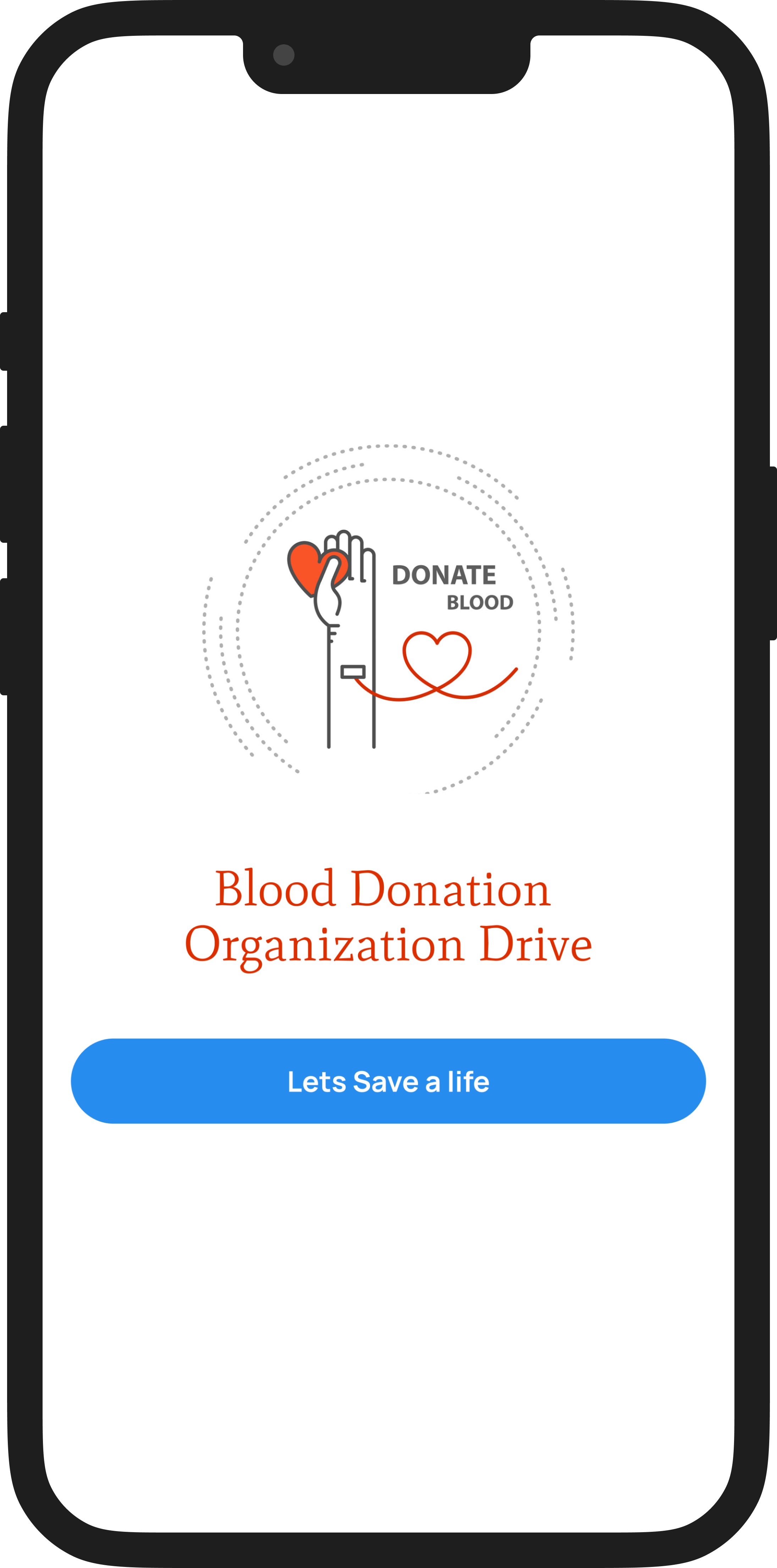
![Smartphone screen showing an app for a blood donation organization with an illustration of a hand holding a heart and a blood bag, and a blue button labeled 'Lets Save a life'.]()
Splash Screen
-
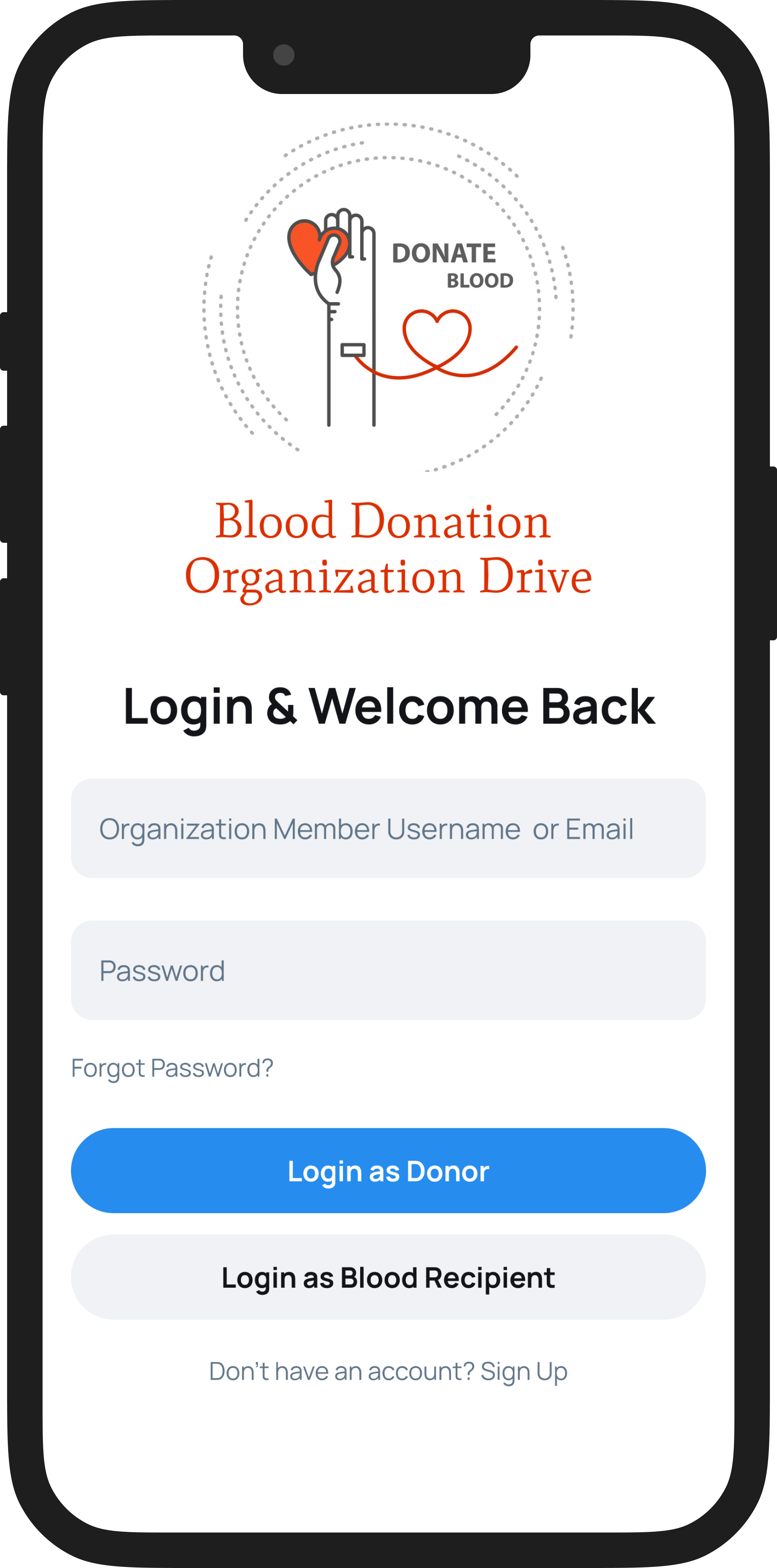
![Mobile app screen for a blood donation organization drive login page, featuring fields for organization member username or email, password, options to log in as donor or blood recipient, and sign-up link.]()
Main Login Screen
-
![Mobile app screen showing a blood donation profile for Ethan Carter with a profile picture, blood type O+, donor ID, next donation eligibility date, and icons for navigation.]()
Blood donor Homepage
-
![Mobile app screen showing a calendar interface to schedule a donation, with the date set to October 5, 2024, and available times listed below.]()
Schedule Donation
-
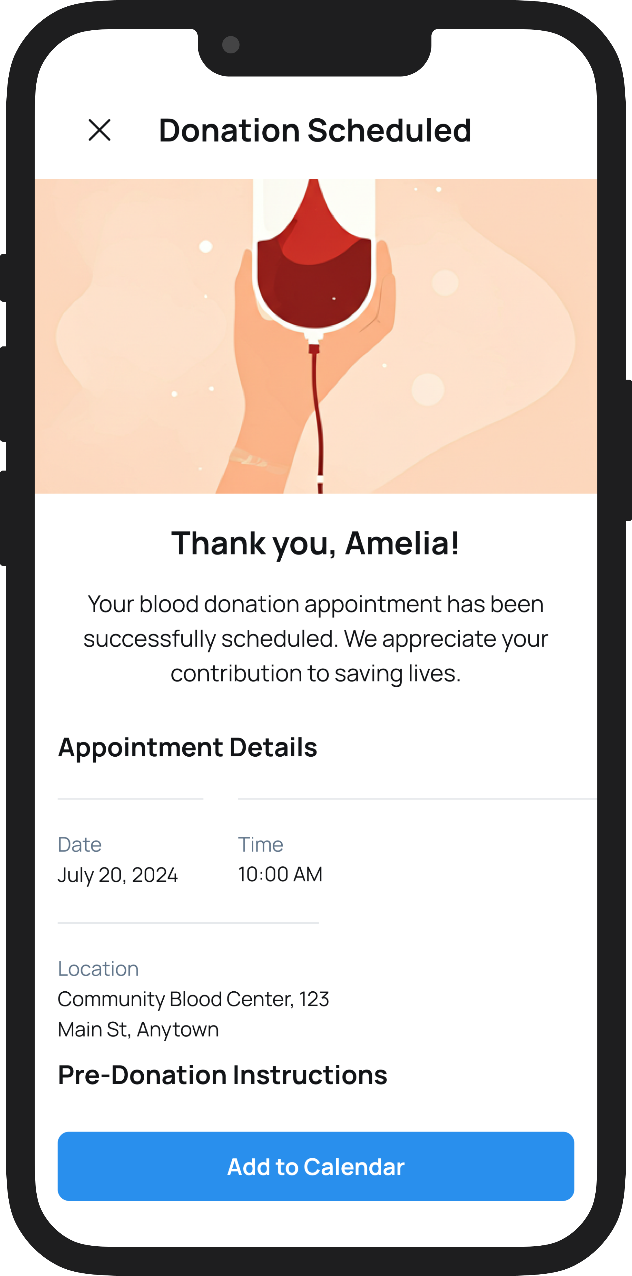
![Screenshot of a mobile app confirming a scheduled blood donation appointment, showing a blood bag illustration, appointment details, and a blue 'Add to Calendar' button.]()
Details of Appointment
-
![A mobile app screen displaying a donation history list with entries for various charitable activities including donations to food banks, disaster relief, children's education, animal shelters, and community clean-up events, each with dates, locations, and icons.]()
Donation History
-
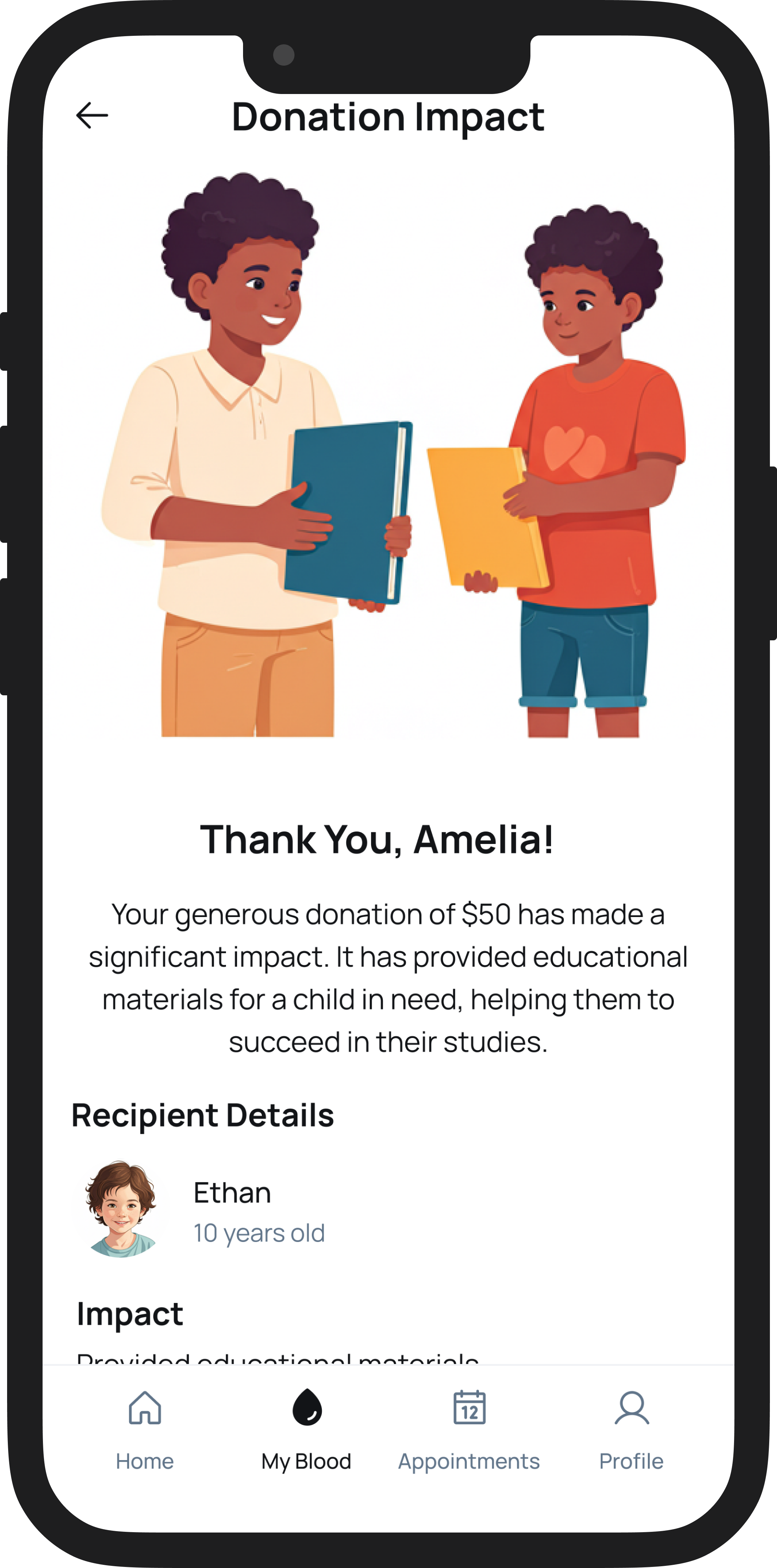
![Illustration of two children exchanging folders, with a donation impact message thanking someone for a $50 donation that helped provide educational materials for a child in need.]()
Donation Impact
-
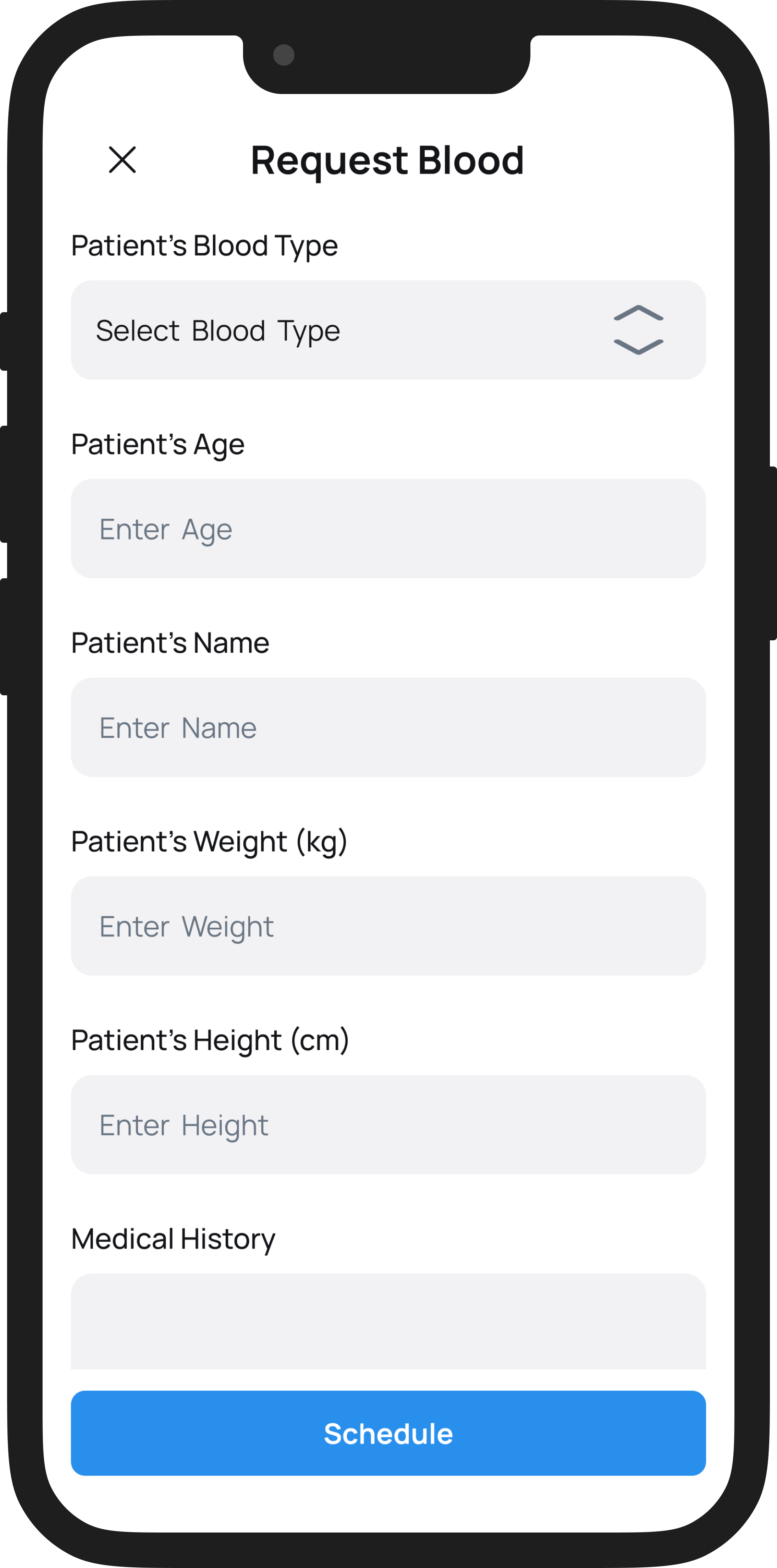
![Mobile app screen showing a medical form titled 'Request Blood' with fields for blood type, age, name, weight, height, and medical history, and a blue 'Schedule' button at the bottom.]()
Blood Recipient Request Form Screen
-
![Mobile app screen showing a list of blood donors with their IDs, donation dates, and buttons to select each donor.]()
Matching Donor screen with all filled Information
-
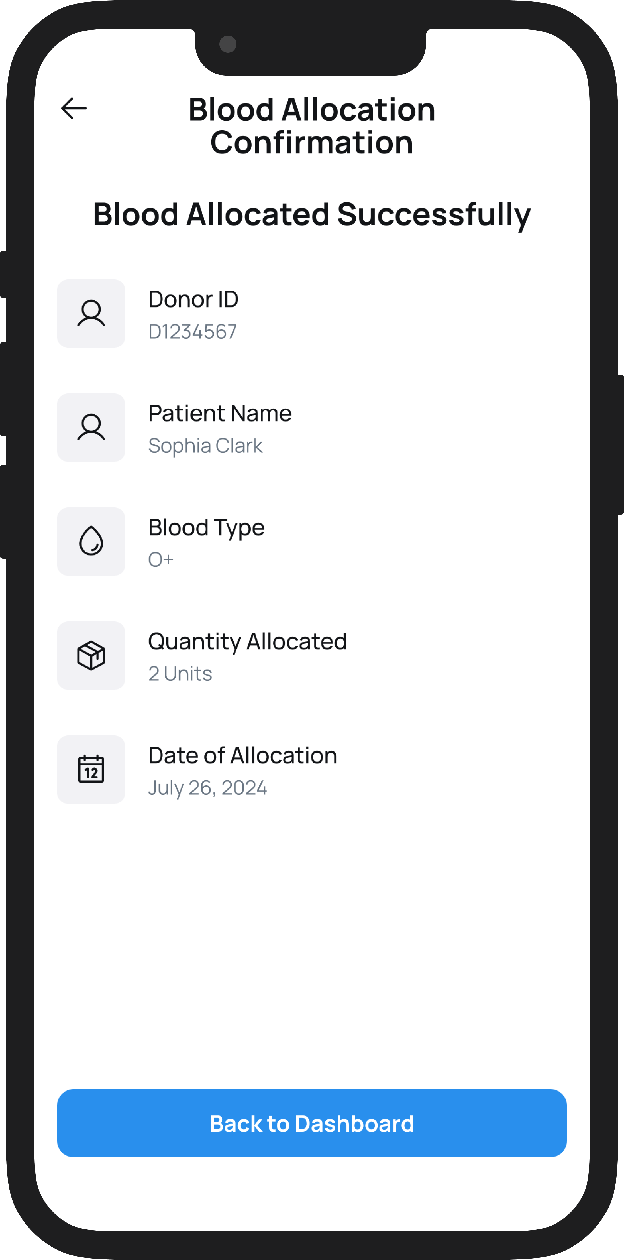
![Mobile screen display showing blood donation confirmation with details: donor ID, patient name (Sophia Clark), blood type (O+), quantity (2 units), and date (July 26, 2024). A blue button at the bottom says 'Back to Dashboard'.]()
Blood Allocation Confirmation Screen
-
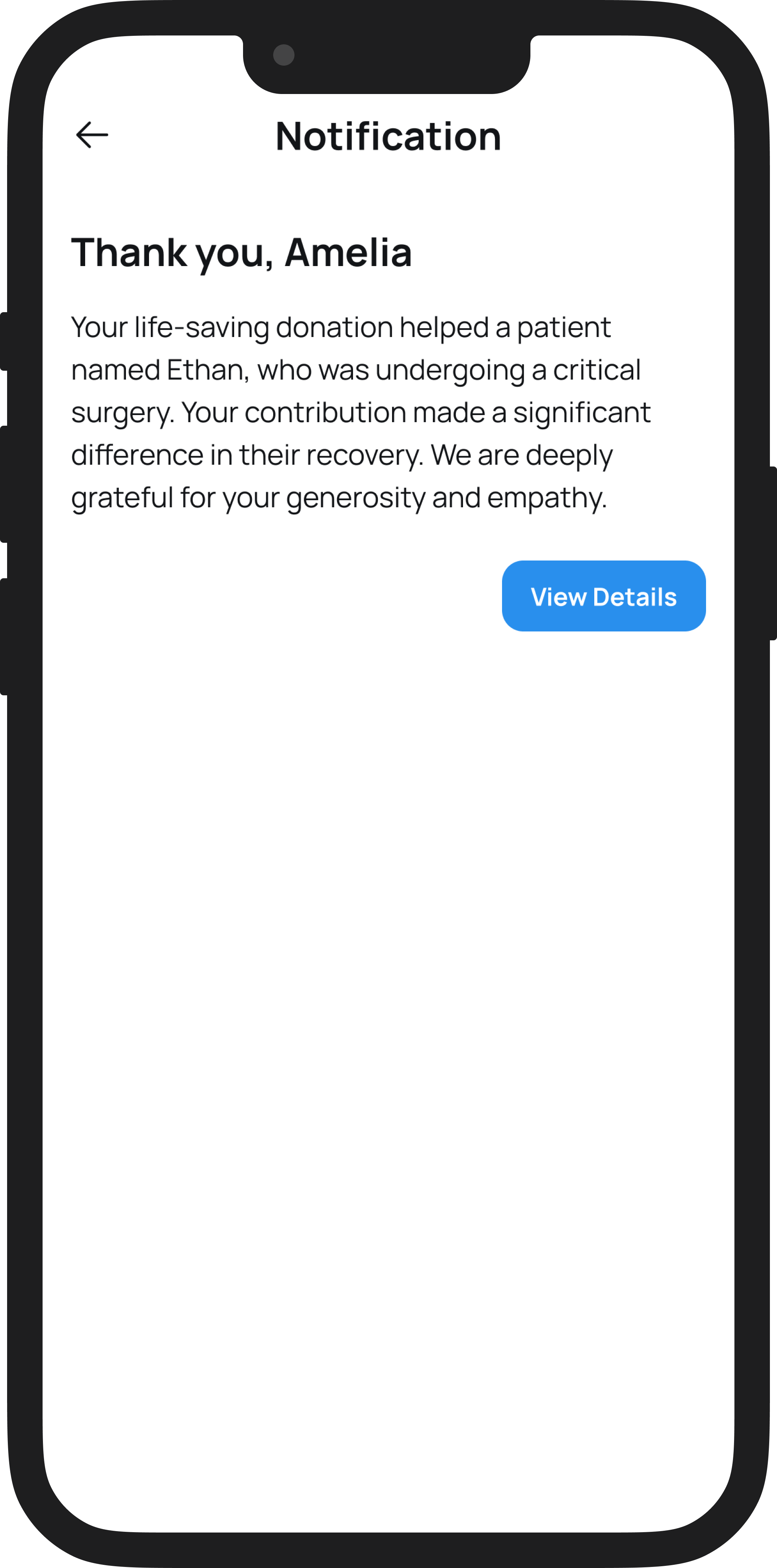
![Mobile phone displaying a notification message thanking Amelia for a donation that helped a patient named Ethan recover from surgery, with a blue 'View Details' button.]()
Notification and Thank you Screen
-
![A mobile app screen showing information about donation impact, including sections on supporting education for underprivileged students and creating safe foster homes, with illustrations of children and homes.]()
Our Impact Screen


A Quick Peek Into the Solution
We launched a functional MVP of the project, with:
Fully responsive web-based platform built around user-centered design
Donor login, onboarding, history tracker, and virtual rank system
Admin dashboard with role-based task flows for managing blood types, camps, and pathology centers
Unified design system for consistency across web/mobile and easier engineering handoff
WCAG 2.1 compliant accessible UI
Performance-monitored prototype backed with analytics insights for ongoing iteration
Understanding the Problem
We conducted discovery sessions, user interviews, and behavioral mapping to understand:
Why young users don’t return after their first donation
What prevents hospitals from digitizing their records
How to make the donor feel emotionally connected to their act
The common threads:
"I don’t know if my blood was used."
"I didn’t get any kind of update or reward."
"We use Excel sheets and handwritten logs."
This pointed to the need for a transparent, intuitive, and motivating experience
for both sides.
Target Audience:
Primary Archetype: The Conscious First-Time Donor
Age: 22 | Gender: Female | Location: Metro City
Motivation: Wants to contribute meaningfully and socially
Frustration: Doesn’t get any follow-up or update after donating
Goal: Wants to donate regularly and feel part of something impactful
Tertiary Archetype: Mr. Rajan (The Admin Operator)
Age: 38 | Gender: Male | Location: Government Blood Bank
Motivation: Needs a clean, manageable system for large data
Frustration: Manual entries, Excel errors, no real-time search
Goal: Streamline data, reduce error, and speed up processing
3 Type of Users
Secondary Archetype: Neha (The Willing but Uninformed Donor)
Age: 24 | Gender: Female | Location: Tier-2 City
Motivation: Has the will to donate and help others, especially during emergencies or drives
Frustration: Doesn't know where, how, or when to donate blood lacks guidance or access to verified information
Goal: Needs a trustworthy, step-by-step system that tells her where to go, when she's eligible, and what to do before and after donation

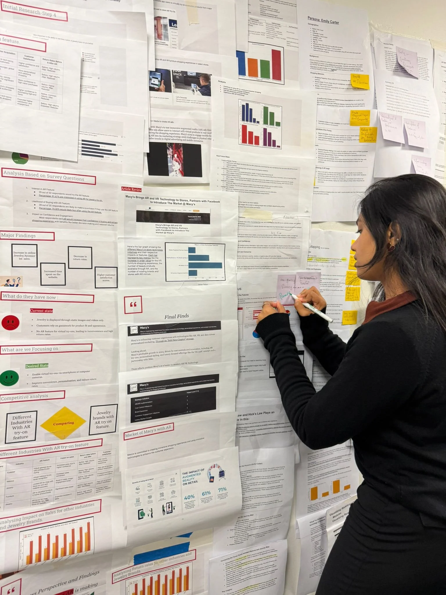
Research & Key Findings
We conducted:
User surveys and interviews (n=256)
Competitive benchmarking (15 platforms)
Accessibility audits
Real-user scenario simulations
Findings:
84% of users wanted to know where their blood went
73% responded positively to gamified ranks
Admins completed critical workflows 25% faster
Modules Designed
Donor Onboarding (Email/Phone registration, password recovery)
Blood Recipient ( Email/Phone registration, password recovery)
Request & Search Panel (By blood group, urgency, hospital)
Admin Controls (Add/View blood types, camps, pathology info)
Analytics & Performance Metrics Impact (Donations vs. usage tracked)
Information Architecture
1. Hierarchical Relationships
Dashboard
Donor (Profile, Ranks, History)
Admin (Add, View, Search Modules)
2. Associative Relationships
Ranks ↔ Blood Type ↔ Location ↔ Time
Requests ↔ Donor history ↔ Admin logs
3. Dependency Relationships
Ranks and rewards depend on verified donation logs
Admin view is filtered by Search/Request modules

System Visualisation
UI designed using Figma, with responsive grids and a scalable component library
Final designs tested on both web and mobile via screen-share and clickable prototypes
Feedback captured via usability logs + emotion mapping
Process Breakdown
Brainstorm & Discovery
Competitor & User Research
Low-Fi, Mid-Fi & Hi-Fi Wireframing, Prototyping (Clickable) in Figma.
Usability Testing & Iteration
Final UI Design + Developer Handoff
Performance Setup & Rolloutg
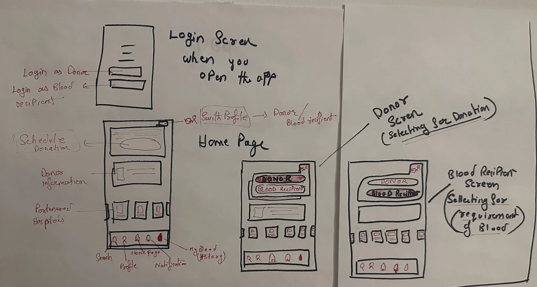
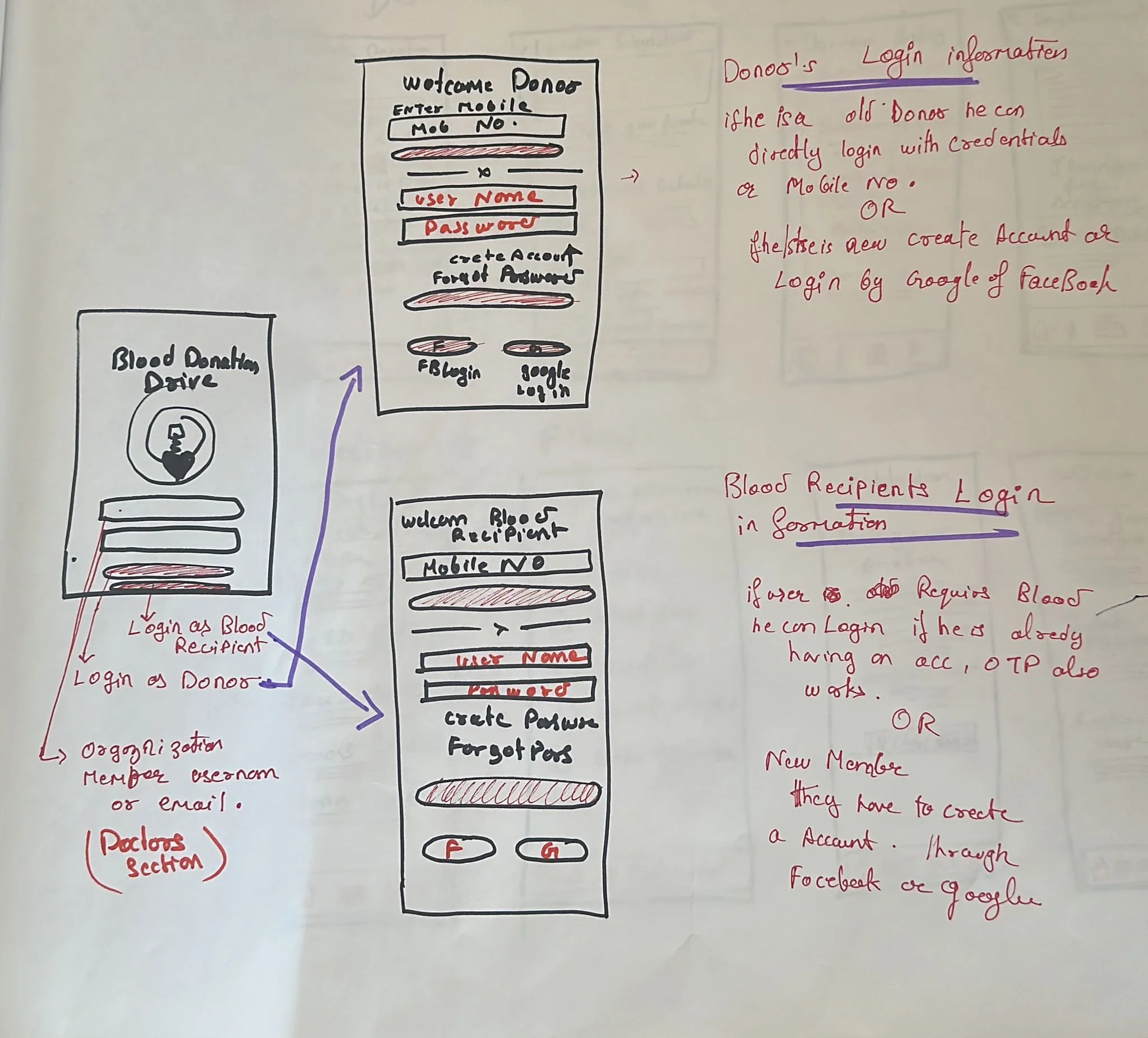
Main Login Screen for Organization and if the user is Donor or Blood recipient he will have two different login screen

Low-Fi Wireframing in Figma
These are the final two main flows of our app donor tracking system and Blood Recipient System.
Low-Fi Wireframing For Navigation Bar
Main Navigation Bar (Visible to All Users):
Regardless of the user type, the main navigation bar includes:
Search: To quickly find blood types, donation centers, or user profiles.
Home: A personalized dashboard based on the user type.
Impact: Showcases how the platform and its users are creating positive change through blood donations and funding.
Notifications: Real-time updates on appointments, blood requests, or donation impact.
Profile: Access and manage personal account details.
Donor-Specific Navigation:
In addition to the main nav bar, donors have access to:
My Blood: A history of their donations, with details on how and where their blood was used.
Schedule Appointment: Allows them to book or manage upcoming donation slots.
This the Main Homepage of the app where you login and then if you want to donate or Require blood from “ From right corner click on Switch Profile Icon” then you can switch from Donors profile to Recipient Profile.

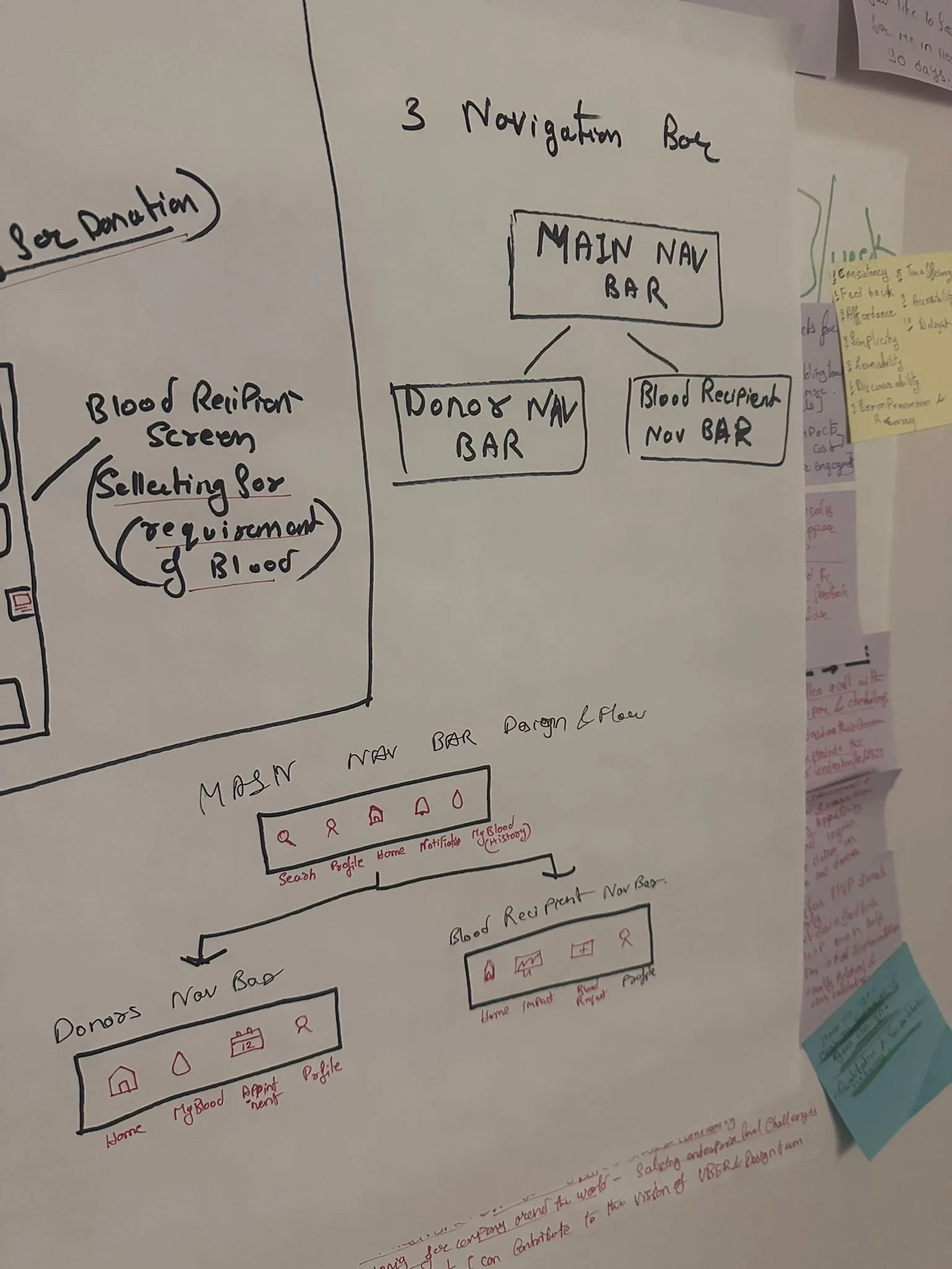
Blood Recipient-Specific Navigation:
Alongside the main nav bar, blood recipients have:
Impact: A detailed view of how their blood purchases contribute to social initiatives (e.g., child education, foster care).
Blood Request Form: Submit and track requests for blood types.
Hi-Fi Wireframing in Figma
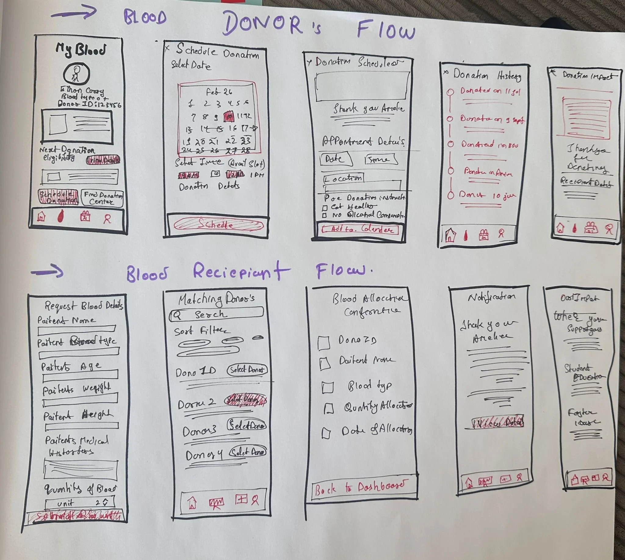
Flow 1
Donor Flow Summary:
The donor journey begins with logging in through the Donor Login screen.
Schedule Donation:
The donor selects a date, time, and location for their blood donation. Once scheduled, they are taken to a confirmation screen with an option to add it to their calendar.View Donation History:
After confirmation, the donor is redirected to the "My Blood" page, where they can track past donations and see how often they've donated.Real Impact Stories:
To encourage continued donations, the platform shares feedback from families who received their blood, showing exactly how it helped and who it impacted.Return to Home:
The donor can return to the Home page at any time to begin a new action or explore more
Flow 2
Blood Recipient Flow Summary:
Login:
The user logs in through the Blood Recipient portal.Request Form:
Fills out a form with patient details and required blood type.Match & Select Donor:
The system shows matching donors, and the user selects one.Confirmation:
A confirmation screen appears with the allocated donor and an option to thank them directly.Impact:
Each blood unit costs $50, which is donated to causes like foster care and elderly homes—showing the user how their purchase is making a difference.
Testing Methodology
Participants: 256+ users (donors + admins)
Platform: Localhost prototype with Figma flows
Sessions: 1-on-1 guided tasks + surveys + feedback loops
Metrics Collected: SUS score, time-to-complete, feedback sentiment

Test Results
Quantitative
MetricResultOnboarding Completion93%Simulated Donations82%SUS Score78.6/100Would Use Again84%Admin Task Completion92%Design Task Efficiency+25% improvement
Qualitative
“Ranks made me feel appreciated.”
“This feels like something I’d check often.”
“Admin flow is cleaner than anything we’ve used.”

Key Outcomes
🧠 Improved UX task efficiency by 25%
🚀 Accelerated design handoff speed by 30% through systemization
🩸 Boosted re-engagement intent by 84% through emotional UI
♿️ Complied with WCAG 2.1 for accessibility across user groups
📋 Followed EMR/FDA principles for data compliance-readiness

Final Reflection
This wasn’t just about blood it was about emotion, trust, and action.
With limited time, we created a platform that elevated donor experience, streamlined operations, and laid the foundation for scalable public healthcare systems. The design didn’t just meet user expectations it reshaped them.
With cross-functional teamwork, system-level thinking, and user-centered care, we proved that healthcare UX can be both beautiful and deeply impactful.

"Design is not just what it looks like. Design is how it works and how it makes you feel seen.